Tim Sheiner

I'm a veteran user experience designer with particular expertise in the technical domains of developer tooling, data visualization, monitoring and machine learning. In addition to product design skills, I have expert-level understanding of system thinking, statistical concepts, high scale compute, and biological systems.

My passion is creating interfaces that help people manage complex systems. I’ve designed for users of varying technical levels in many different domains. I excel at this work by meeting users where they are.

"Tim has a special skill for taking apart a complex problem and putting it back together better than anyone I have known. When they are reassembled, even the most complex ideas will flow with new, compelling logic and clarity."

Mark Hovde, (Retired) SVP Strategy and Corporate Development at Certara

Objective

I'm looking for a fulltime position working in any of the following technical domains:

  • developer tooling for creating, testing and deploying software
  • monitoring of operational data from stored or streaming sources
  • system management & control in the areas of logistics, alternative energy, or ecological health.

I'm a hands on designer with a passion for craft so my preferred entry point is as a lead or architect level IC position within an existing design organization. I have also been successful in a player/coach role where, in addition to hands on contributions, my responsibilities included creating a design culture and growing a design team.

Experience

My professional work experience is broad. I've worked on B2B, B2C, and B2B2C products in every sort of commercial design context from consultancies to startups to publicly traded companies. Below are highlights from the last fifteen years of my career.

Workflow Orchestration Platform

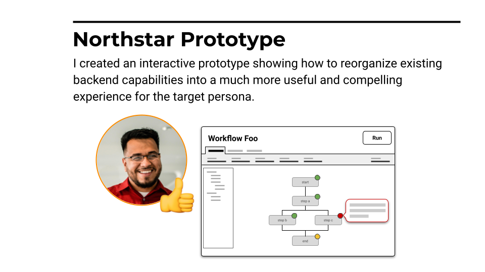
During my short time at this start up I delivered a visual and navigational refresh of the interface, ran several user research programs and created a complete Experience Strategy including design personas, prioritized Jobs To Be Done, and a "Northstar" prototype.

Workflow Orchestration Platform

Union is a commercial open source play founded by the creators of the Flyte orchestration platform. What I found when I arrived was a truly great orchestration platform hidden behind two (!) inconsistent CLIs and an awkward, unattractive GUI.

I began two initiatives to fix this, one tactical, the other more strategic.

Step 1 - Quick UI Refresh

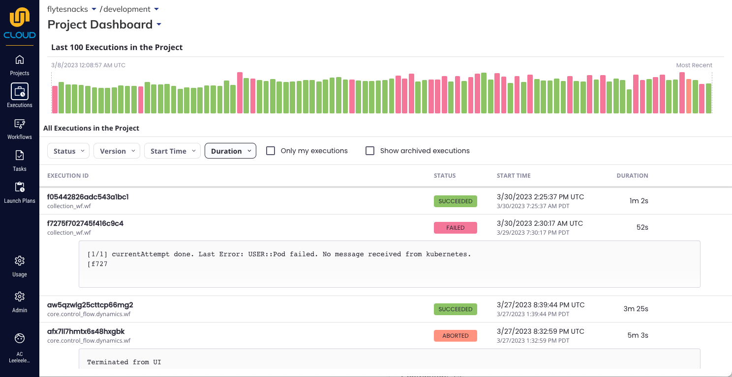
To communicate quickly to our customers that Union had a new focus on user experience, I initiated a UI refresh with 4 objectives:

  • improve the visual appearance and bring it inline with de facto developer console standards
  • align the product branding with the marketing website
  • improve accessibility and navigation with a standard page header and breadcrumbs on every page
  • remove unnecessary whitespace

When we released the refresh several existing customers reached out unsolicited to communicate their delight with the changes!

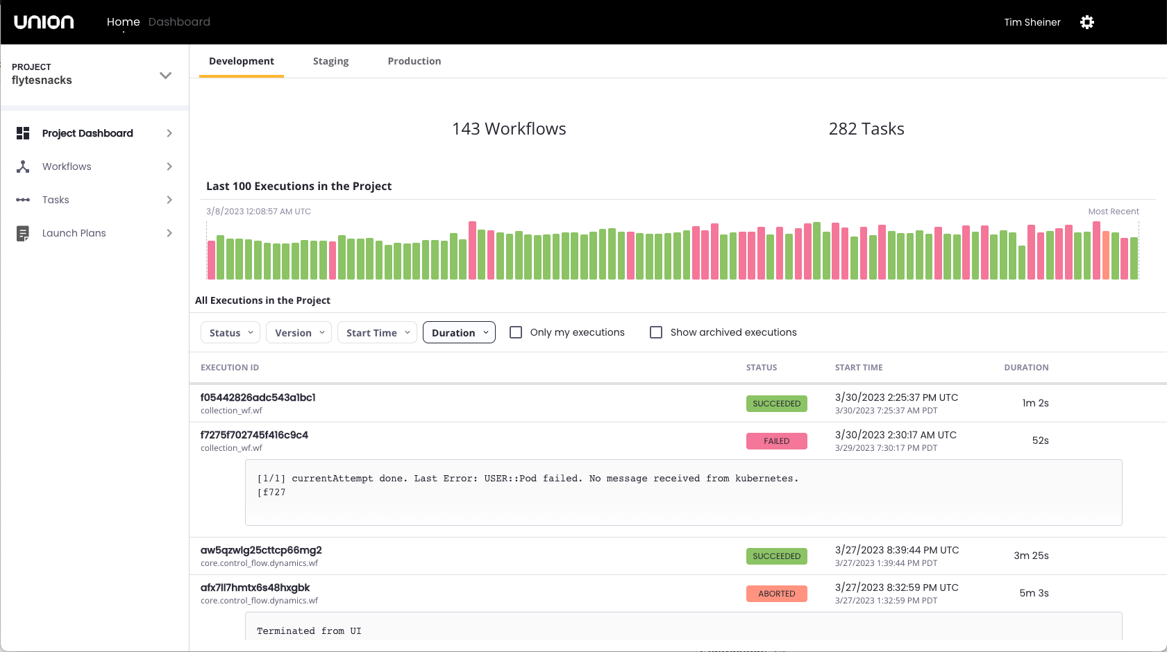
Union UI before the refresh.

Union UI after the refresh

Step 2 - Create a Vision

My more strategic initiative was to develop a product vision. The product team was focused on adding features as fast as possible but lacked even the most basic narrative about target users and their needs. There was no framework for prioritizing one feature idea over another or any structured plan for how the new features fit together into a useful experience.

Therefore, simultaneously with managing the GUI refresh, I created a UX Vision for Union in about 8 weeks.

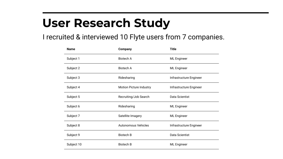
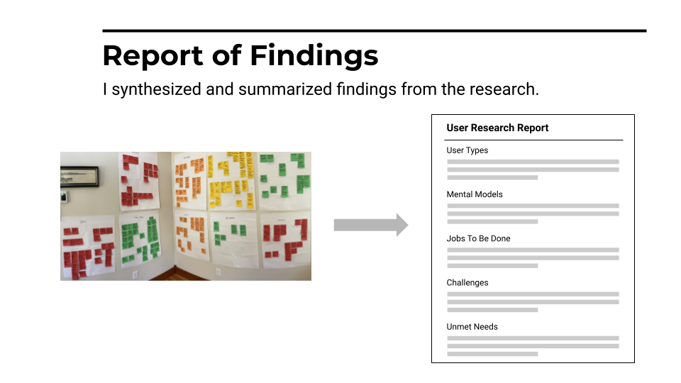
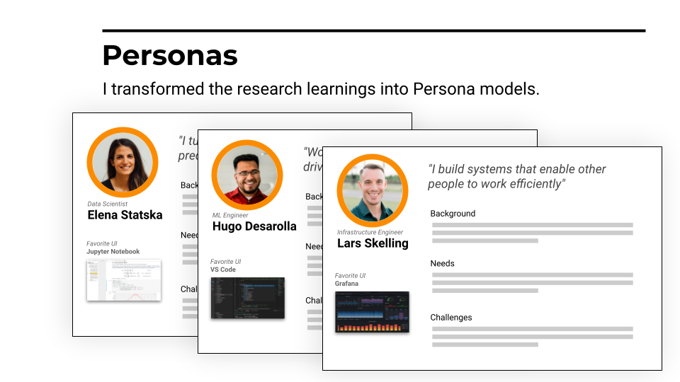
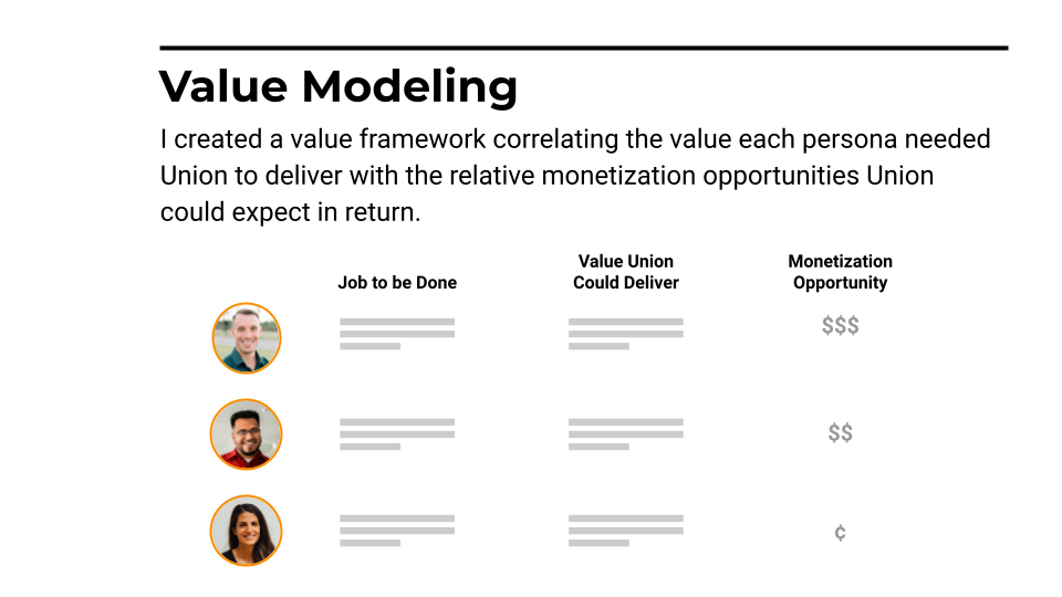
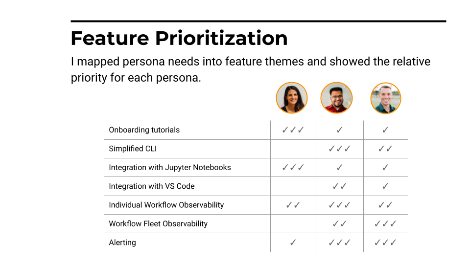
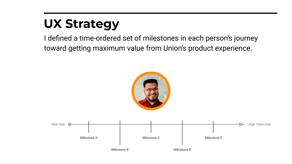
While I cannot show here slides from my actual strategic presentation, I've created schematic stand ins to walk you through the process I used to create an actionable, validated UX vision for Union.

Step 3 - Separate

The delivery of these assets marked the end of my Union story. The company founders were pleased with my strategic work, but unwilling to implement the the way of working that had been part of my hiring conversation. I wish the team the best and am grateful for the learning about distributed systems, Kubernetes and orchestration workflows I gained during my time with them.

Customer Relationship Management Platform

My work at Salesforce focused on developer experience (DX) and design systems. I designed DevOps Center, a project-based, VCS-backed change and release management experience that enables low and pro code developers to collaborate. I also worked on the IoT product and managed our design system team.

Customer Relationship Management Platform

During 6 years at Salesforce I worked in a variety of areas from Design Systems, to IoT, to Developer Experience. Below are case studies for two of my more impactful projects .

DevOps Center

This project had two customer benefits. First, it replaced a much maligned feature called "Change Sets" that had been the only way declarative developers on the Saleforce platform could manage changes. Second, it enabled declarative and programmatic developers to collaborate on projects—something previously not possible natively on the platform—via git and a shared code repository.

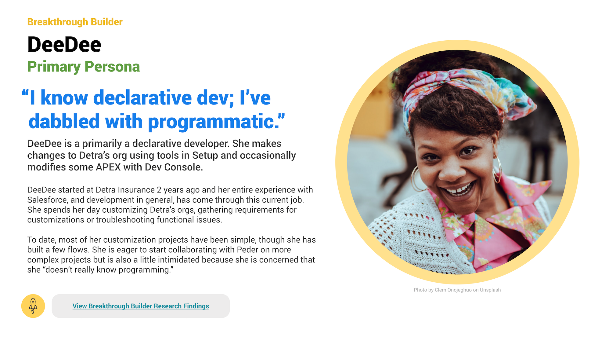
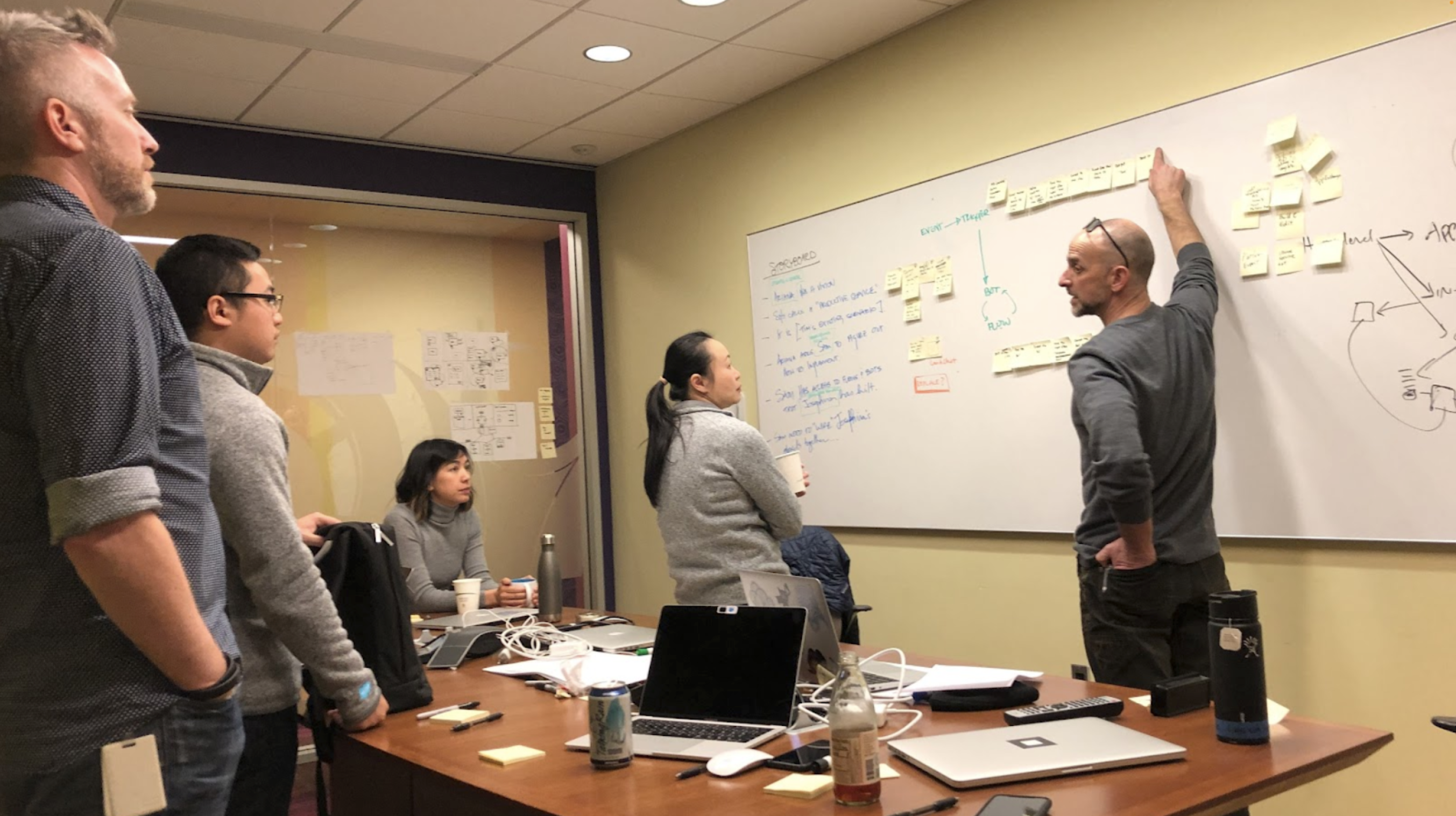
I facilitated the initial framing of the project by developing persona models for us, including DeeDee, our declarative developer persona, and then using collaborative whiteboarding sessions to create product narratives with business and engineering partners.

DeeDee was created by combining new interviews with existing research.

Shared story telling gets stakeholders on the same page

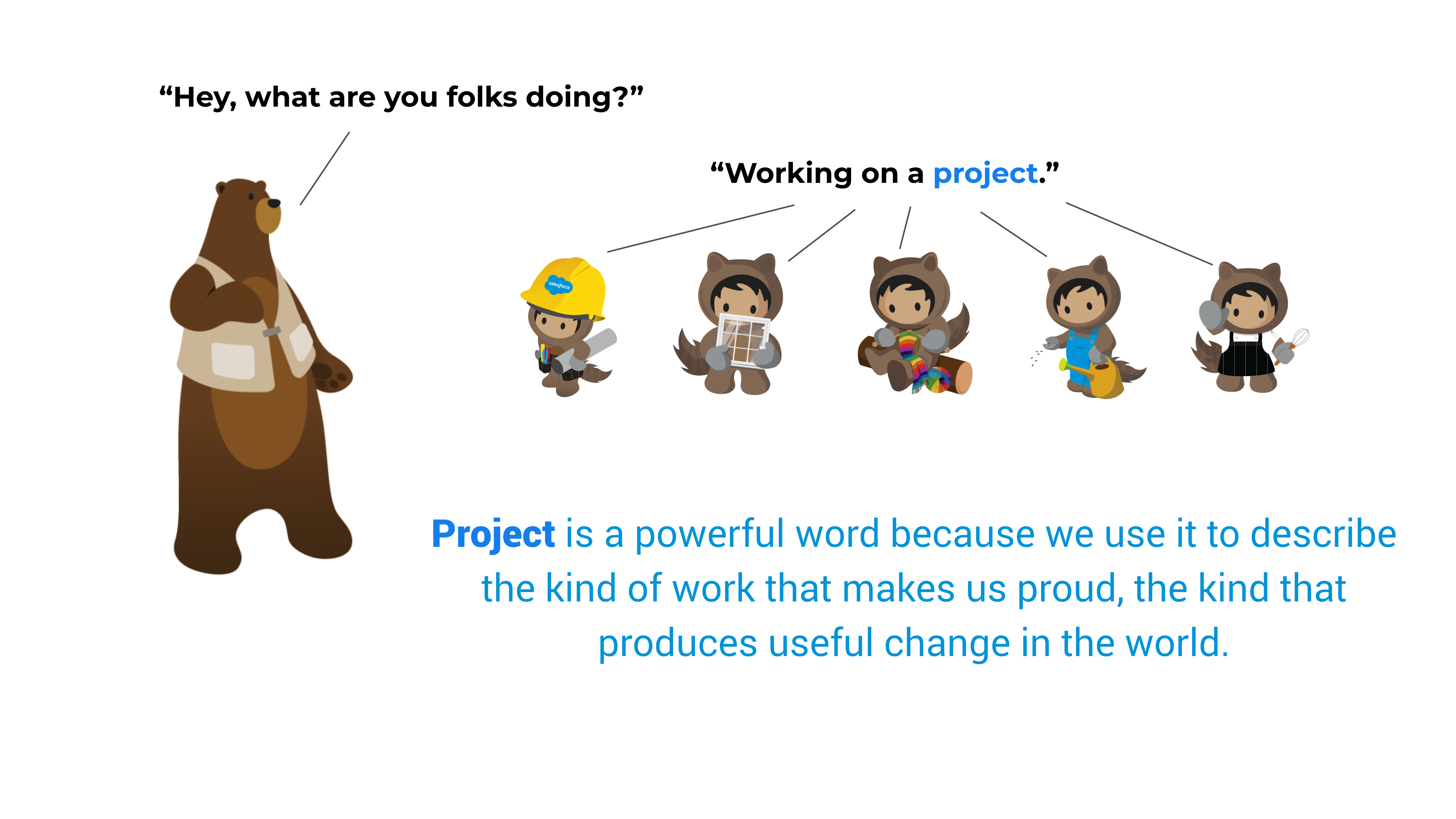
Through our framing work it became clear "projects" needed to be a first class object in the Salesforce system. I created a presentation to communicate and evangelize this notion with executive stakeholders.

Prior to DevOps Center, declarative developers had no way to organize work into projects

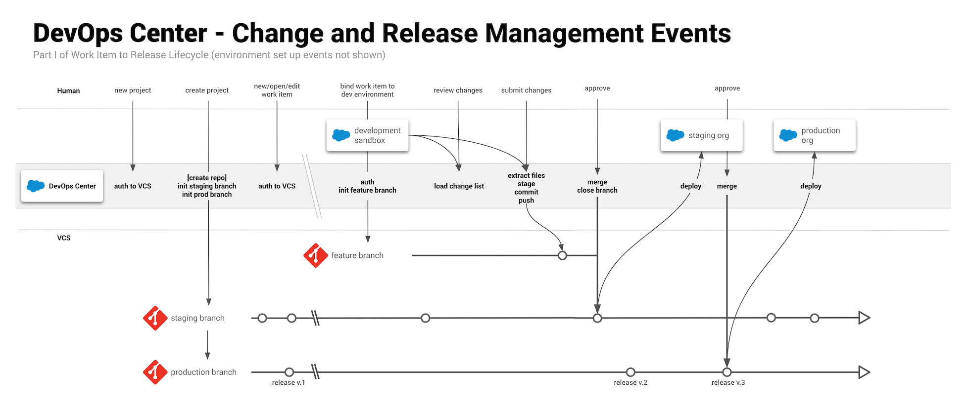
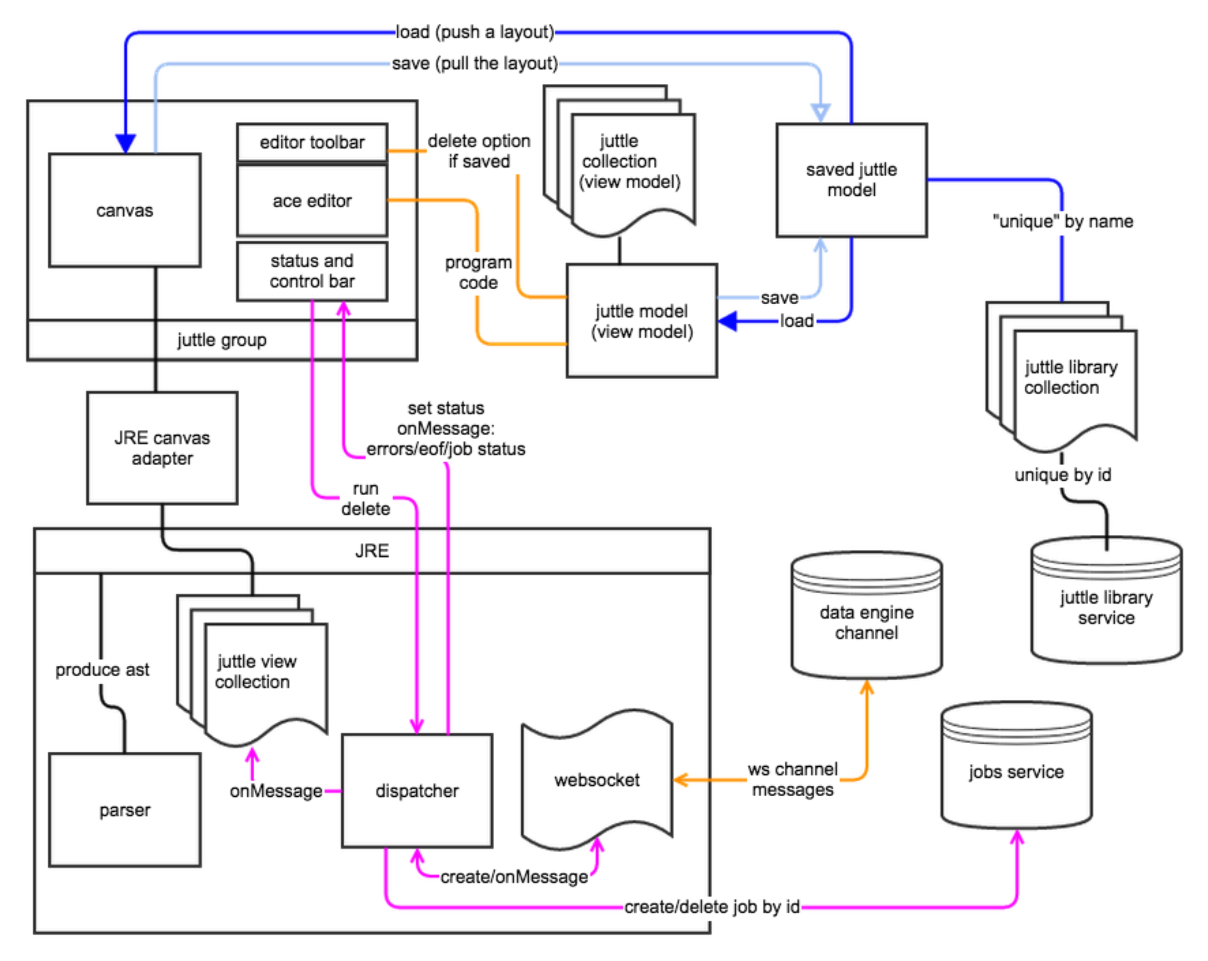
To help ensure that design, business and engineering partners were thinking about the the technical challenges in the same way, I visualized the synchronization between the GUI we were building for DeeDee, the CLI commands that Pedro, her programmatic developer partner, would be using and the underlying git branch model.

A visualization of the synchronization model for DevOps Center

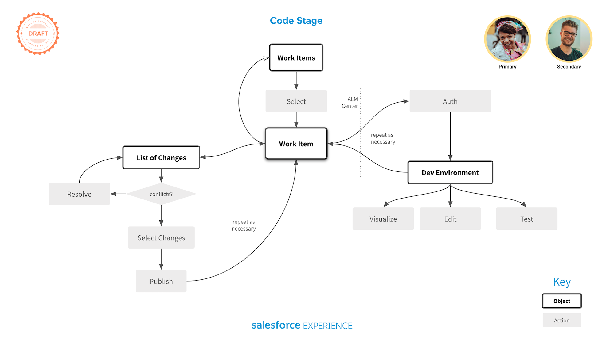
I visualized all of the product workflows to ensure we were considering all happy path and error transitions.

All product workflows began as stories about DeeDee and Pedro working together

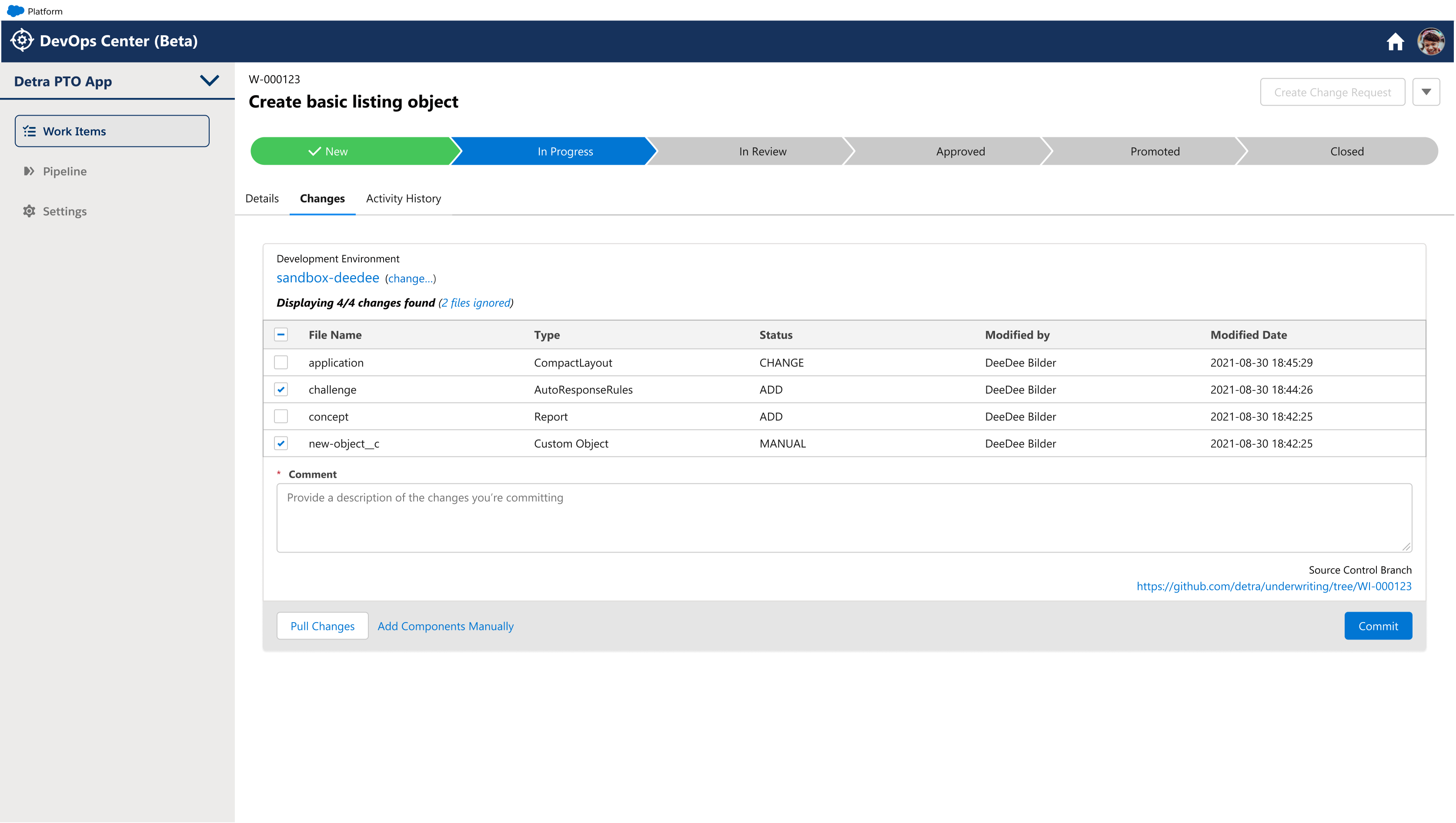
I championed the "work item" concept as the central organizing principle for DevOps Center in order to provide DeeDee with an intuitive entry point into understanding the standard Agile model of software development. The work item was also the central UI conceit for visualizing the creation and movement of changes through the system.

a form for submitting changed metatdata

The work item GUI for committing changes to source control

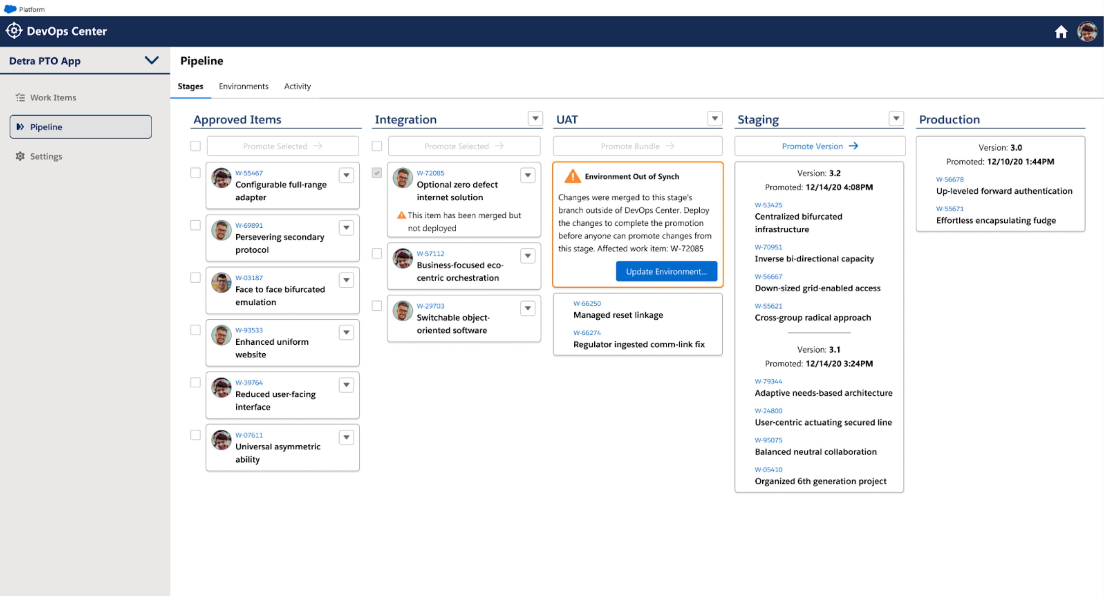
a kanban arrangement of release stages and work items

A visual release pipeline for tracking changes, grouped by work item, from development to production

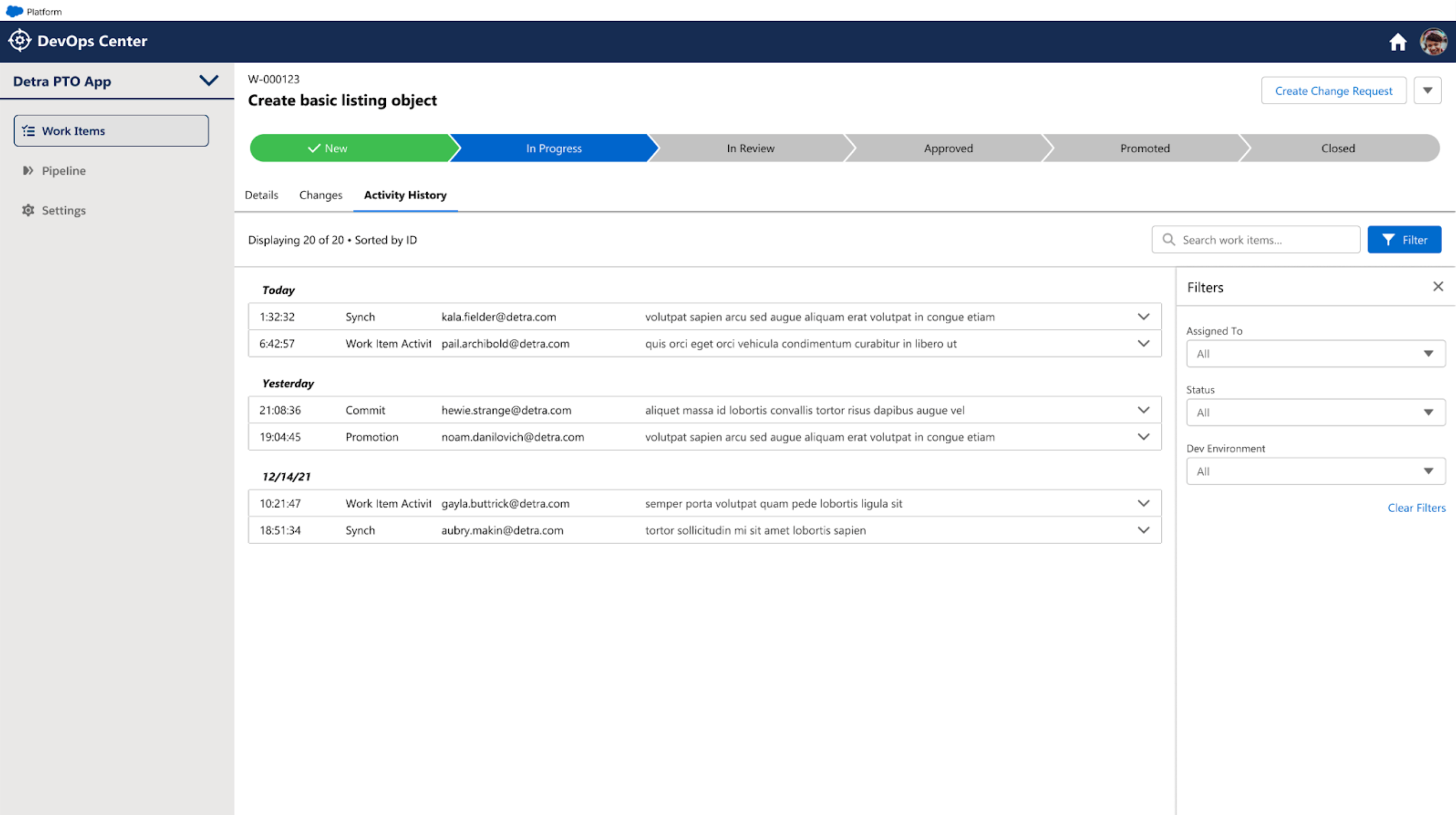
The activity history view was critical for troubleshooting errors and building trust in the system.

IoT, Events & Monitoring

Another focus area for me at Salesforce was the broad concept of monitoring, an increasingly important aspect of managing business operations. My work in this area began with the IoT project and then I expanded the scope from there.

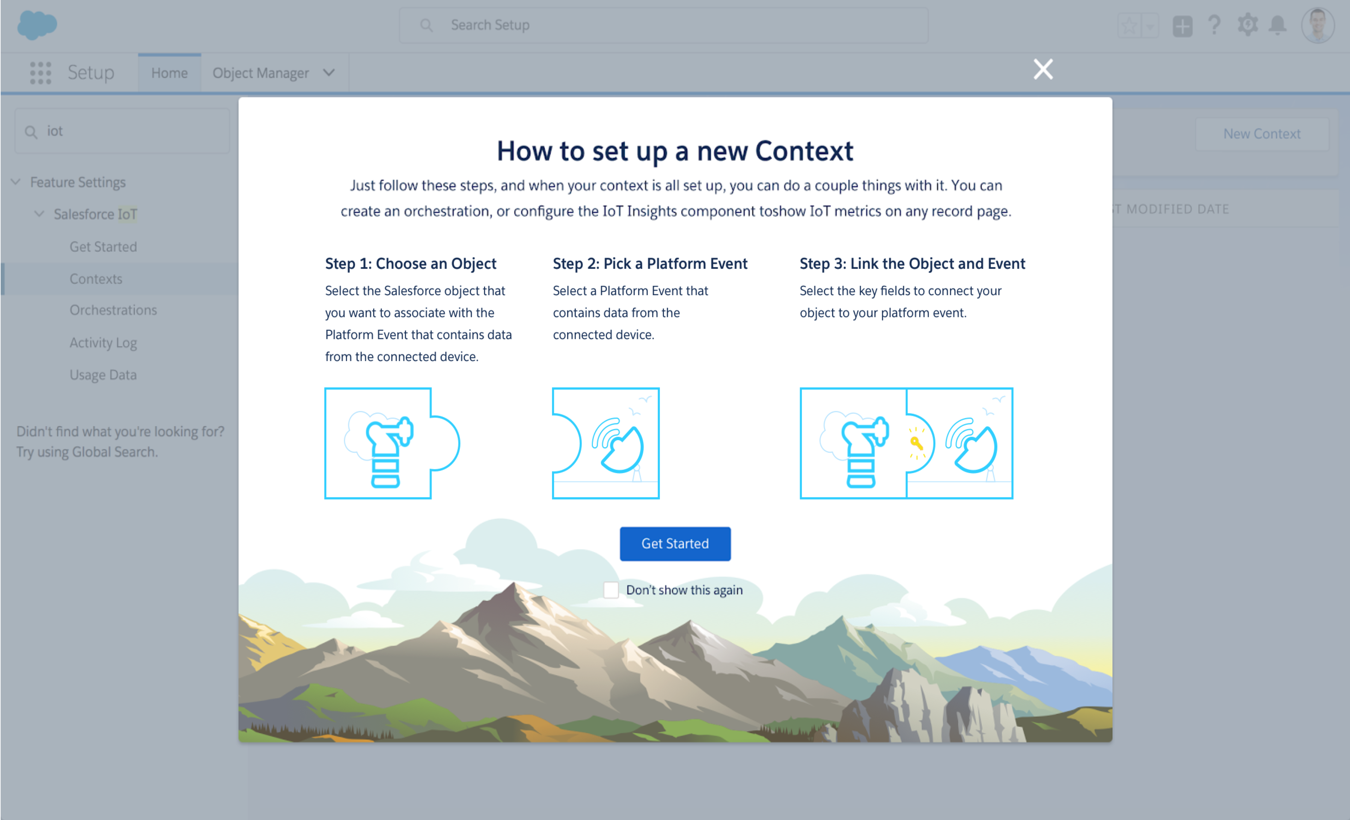
When I joined to the IoT project, a focus on steady state functionality had had the side effect of the team more or less ignoring the onboarding experience. Through a consensus-building effort I managed to bring executive focus to this area and get funding to implement design changes that reduced the number of set up steps by more than half.

My redesign of the onboarding experience began by presenting a narrative.

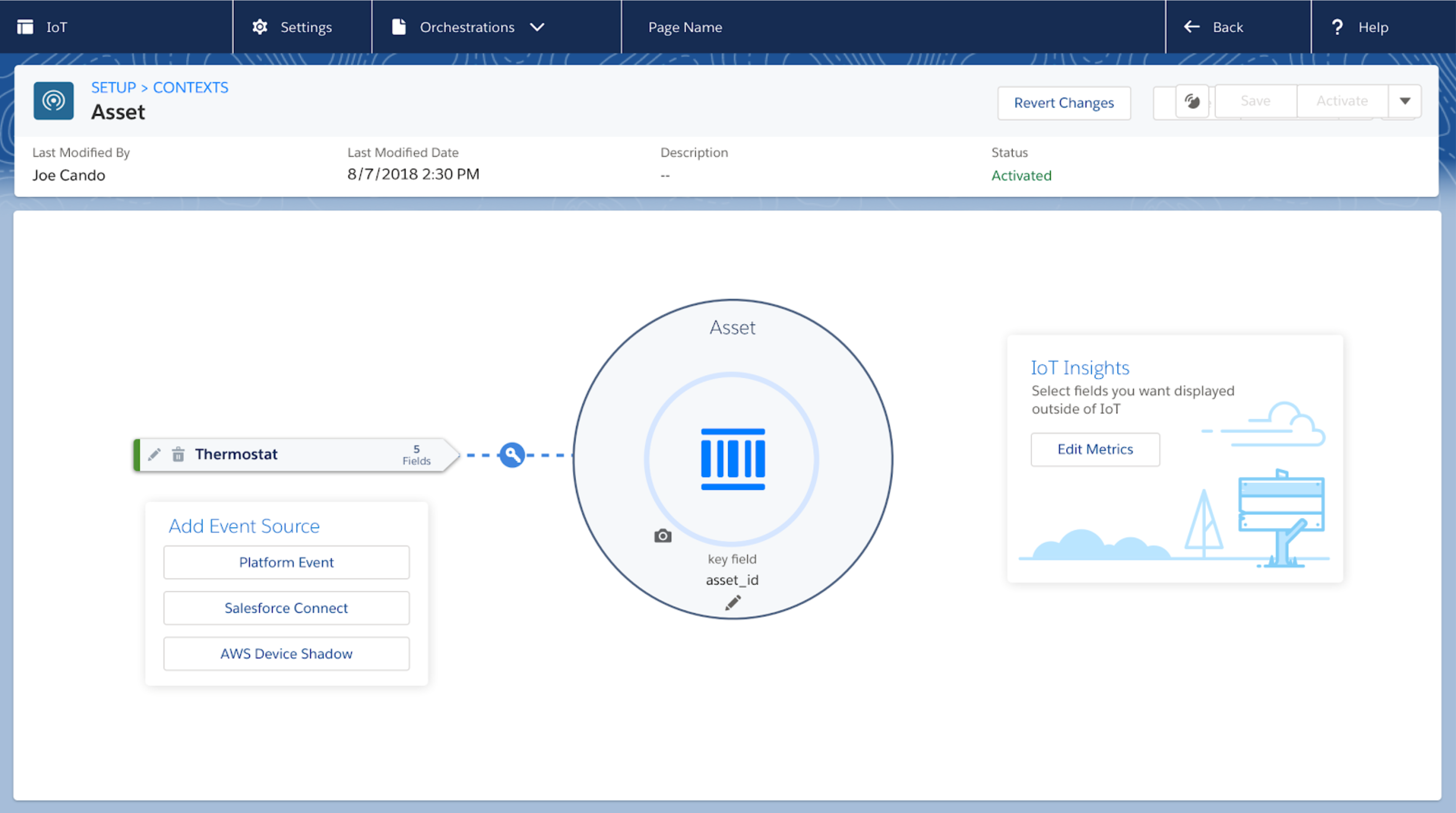
I re-worked the set up screen around a metaphor of connecting objects together

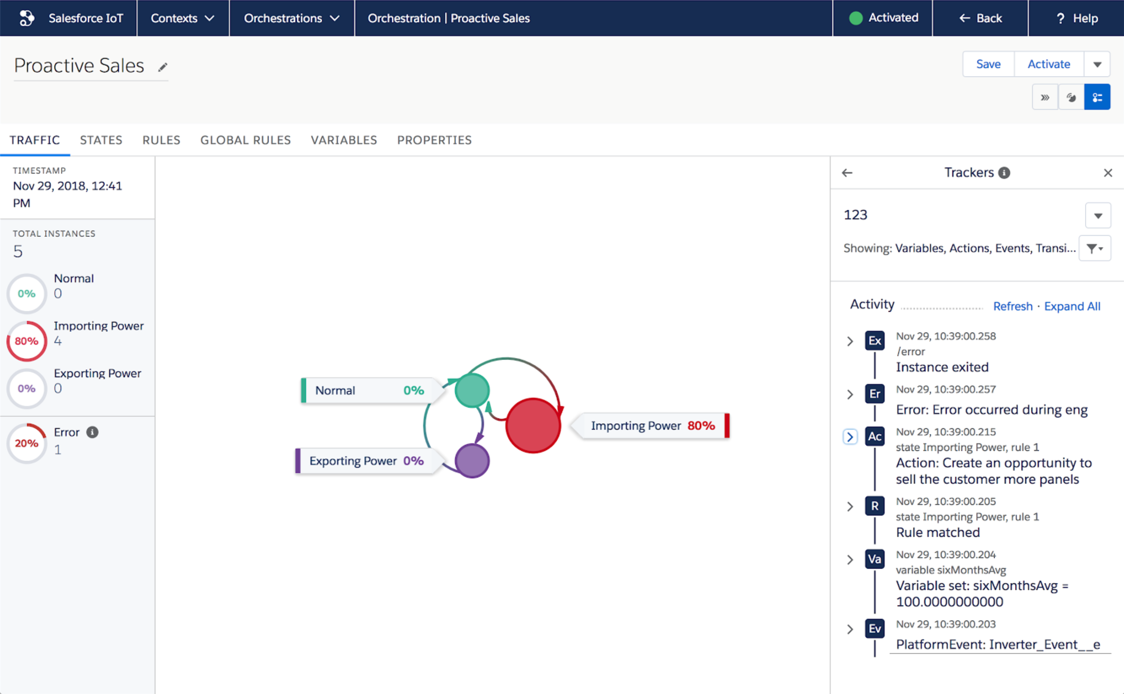
I also focused on the workflow for debugging the orchestration logic. I improved this experience tremendously by introducing tools to send test events, view incoming events and display an activity history that showed everything the engine was doing as scrollable feed.

The Activity View made it much easier to find and debug logic errors

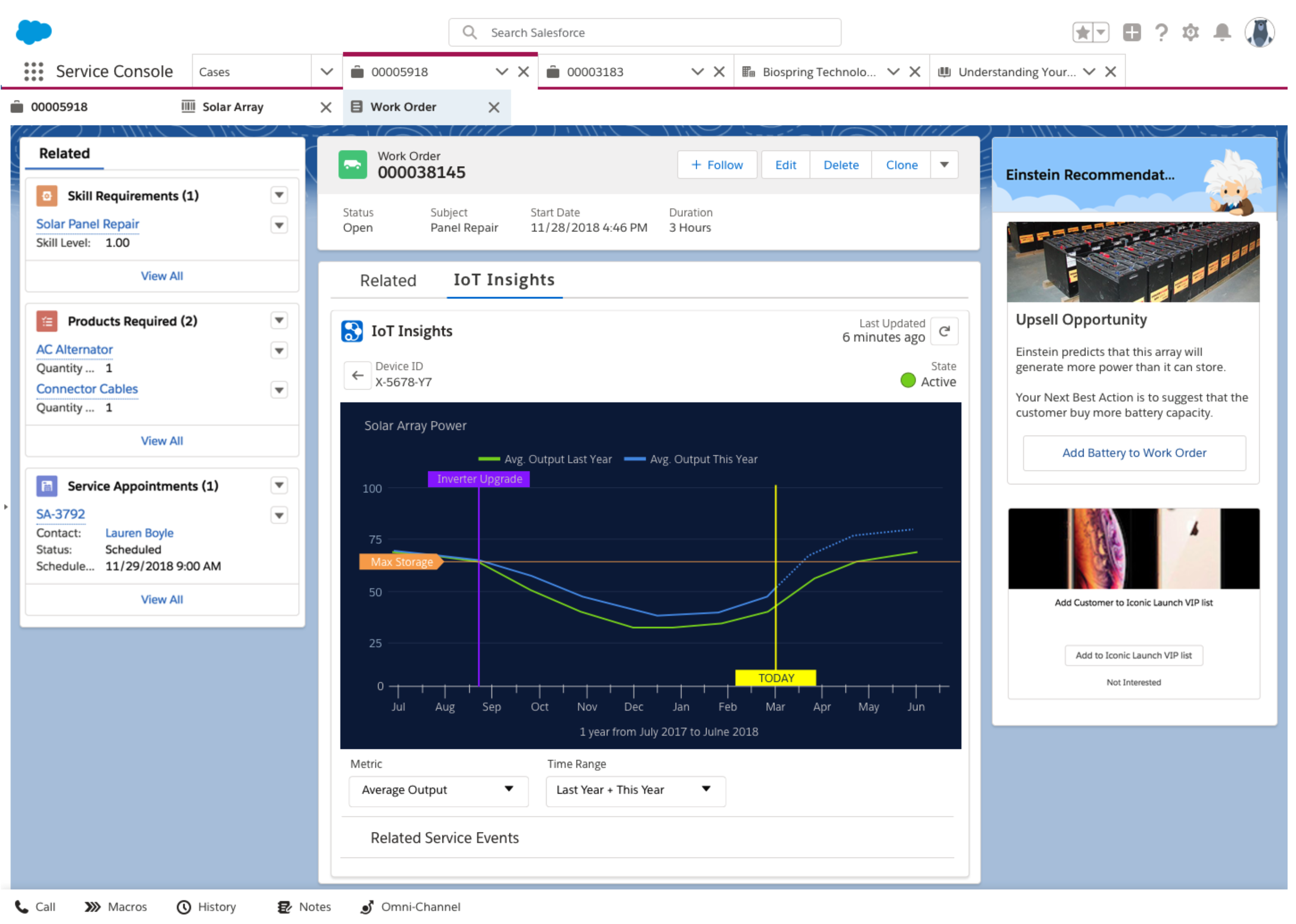
In order to expand the utility of the IoT feature set, I partnered with business and engineering to develop a simple UI component, called "IoT Insights" that could be placed anywhere on any Salesforce page to report current and historical events for connected objects.

A great use of the Insights component was to enhance a call center support UI

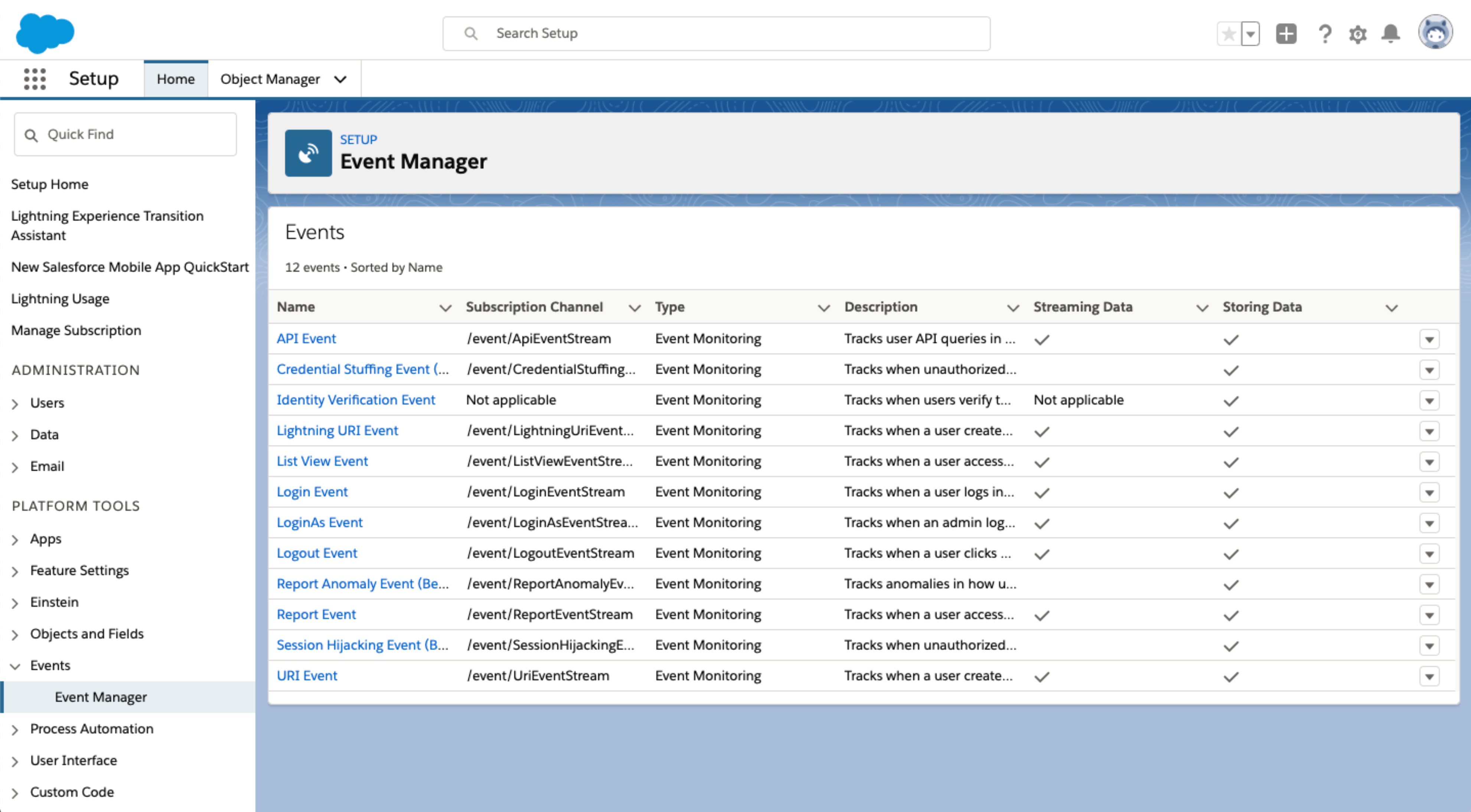
After creating IoT Insights, I pursued a number of projects to increase the visibility of events on the Salesforce platform as well as enable internal feature teams to understand monitoring concepts and how they might apply to their particular features.

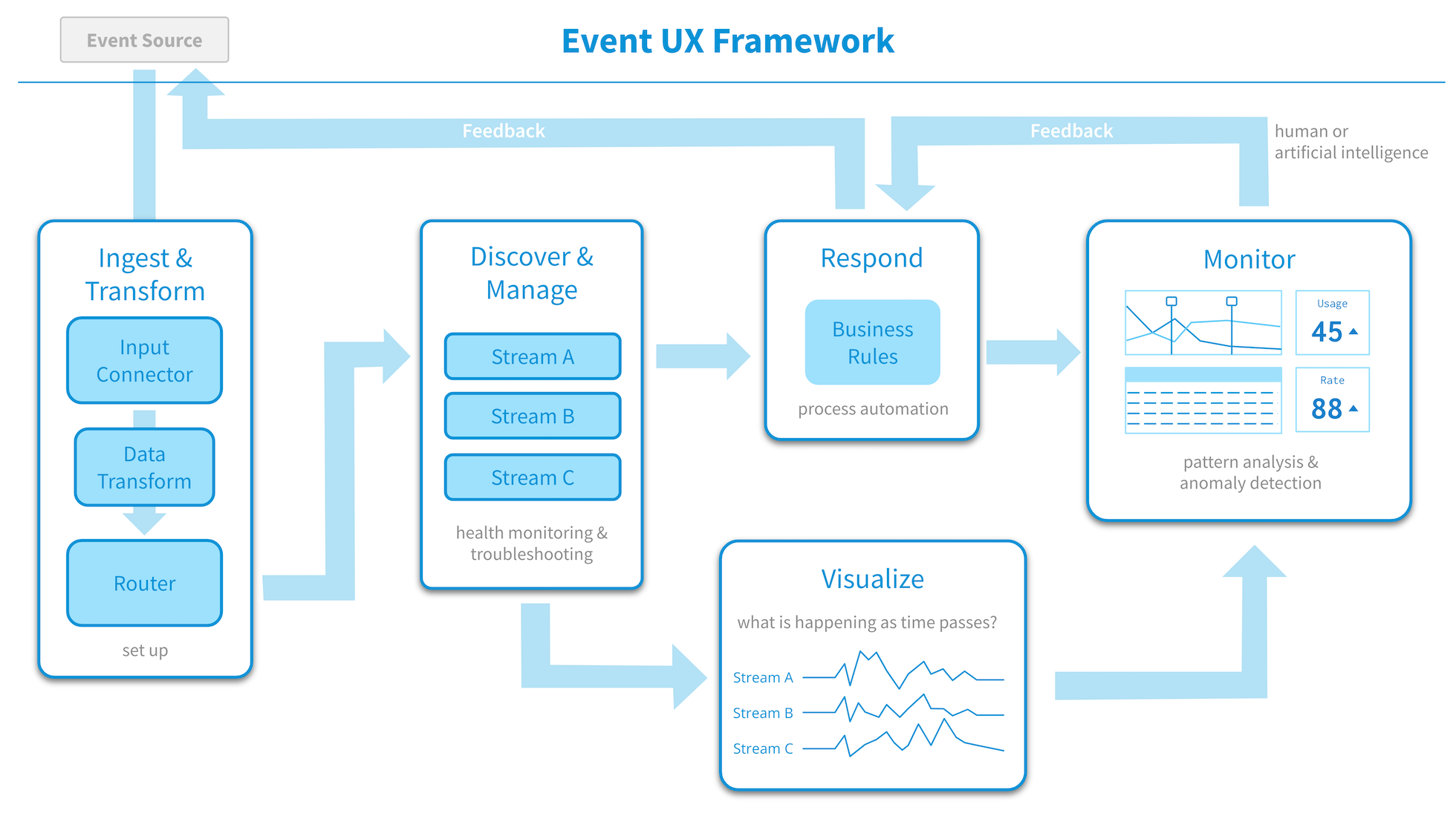
As a first step I developed a visual model to help people understand and talk about the event monitoring workflow.

A standard model faciliates product conversations

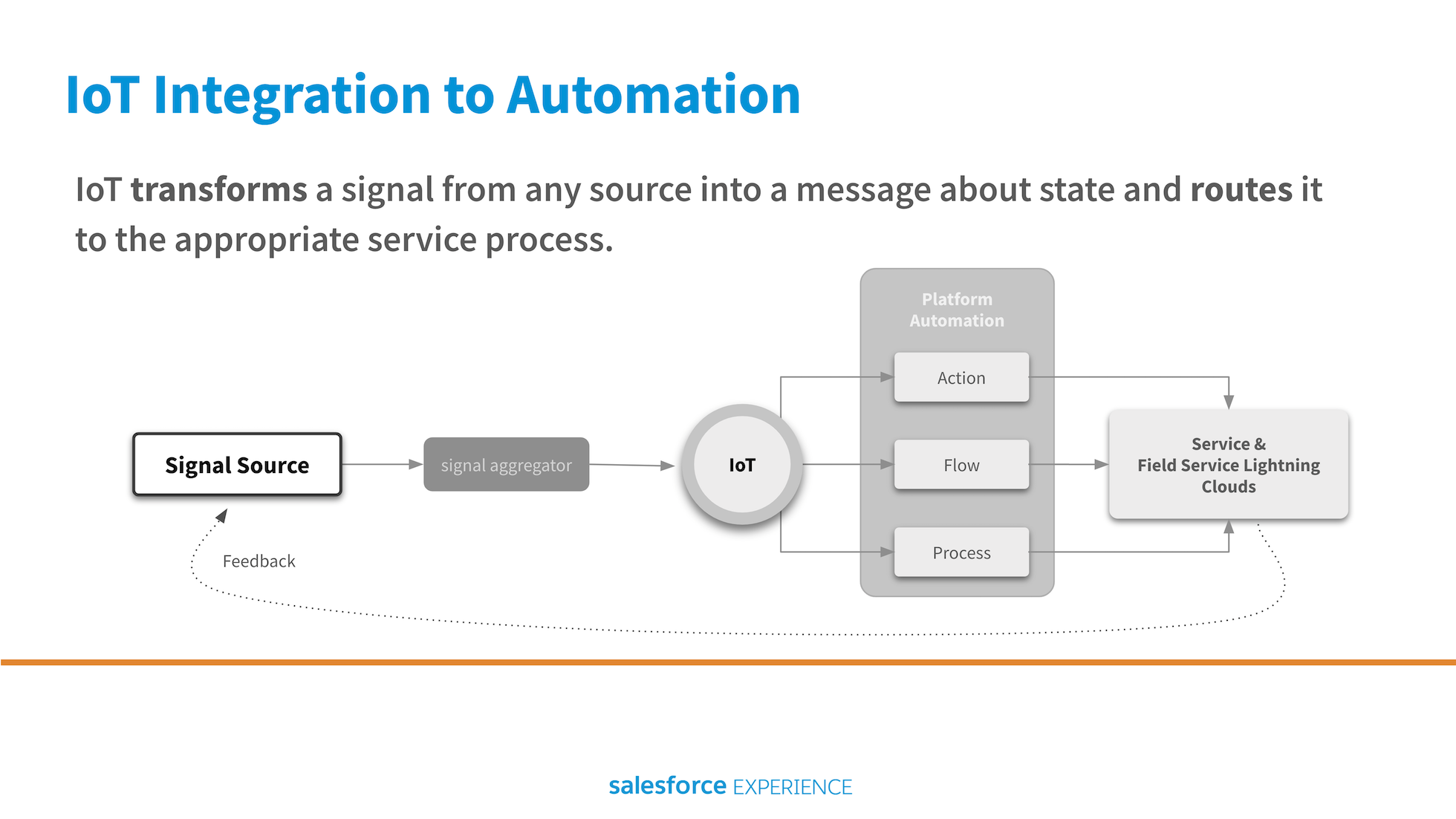
I worked to show the automation team how to incorporate event-based triggers to their offering.

Event based connections between systems is the future.

I championed the simple but powerful idea of listing all available events directly in the UI instead of requiring developers to consult documentation.

Showing people what is available triggers creativity

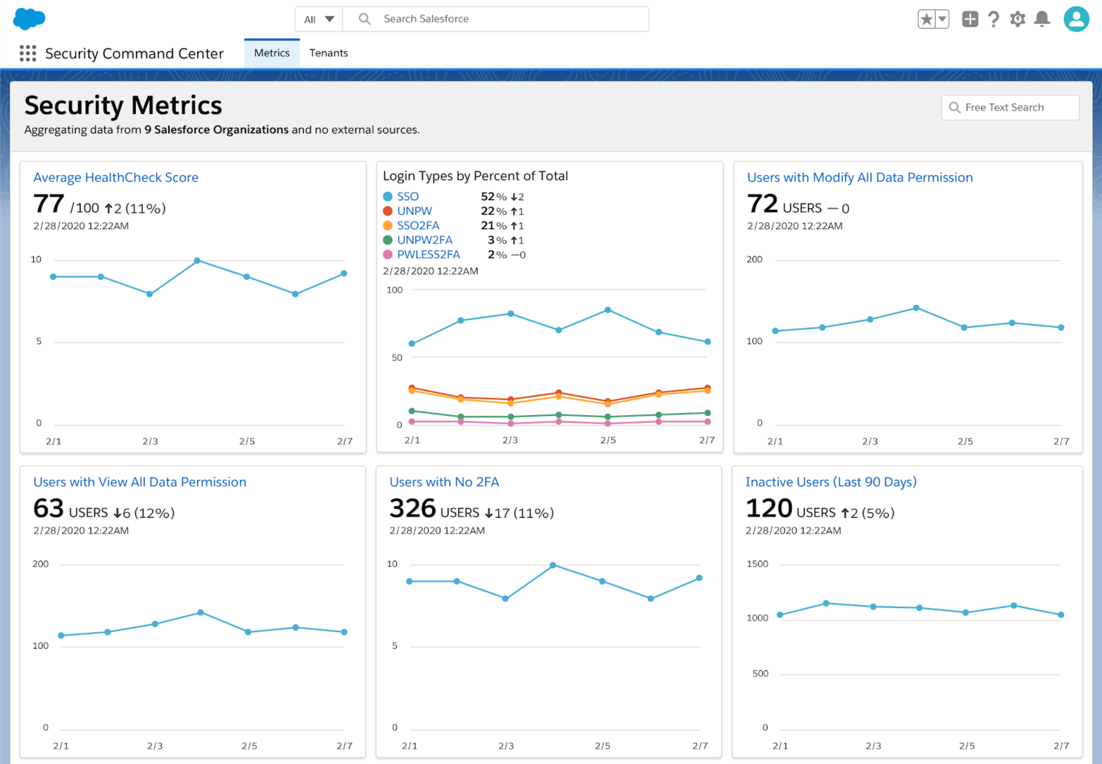
I designed several dashboard products that brought event monitoring to operations management. One was an entirely new feature for admins that enabled them to visualize, and create alerts on, security metrics aggregated across all the nodes in their Salesforce installation.

A dashboard containing standardized metric displays is easy to 'read'

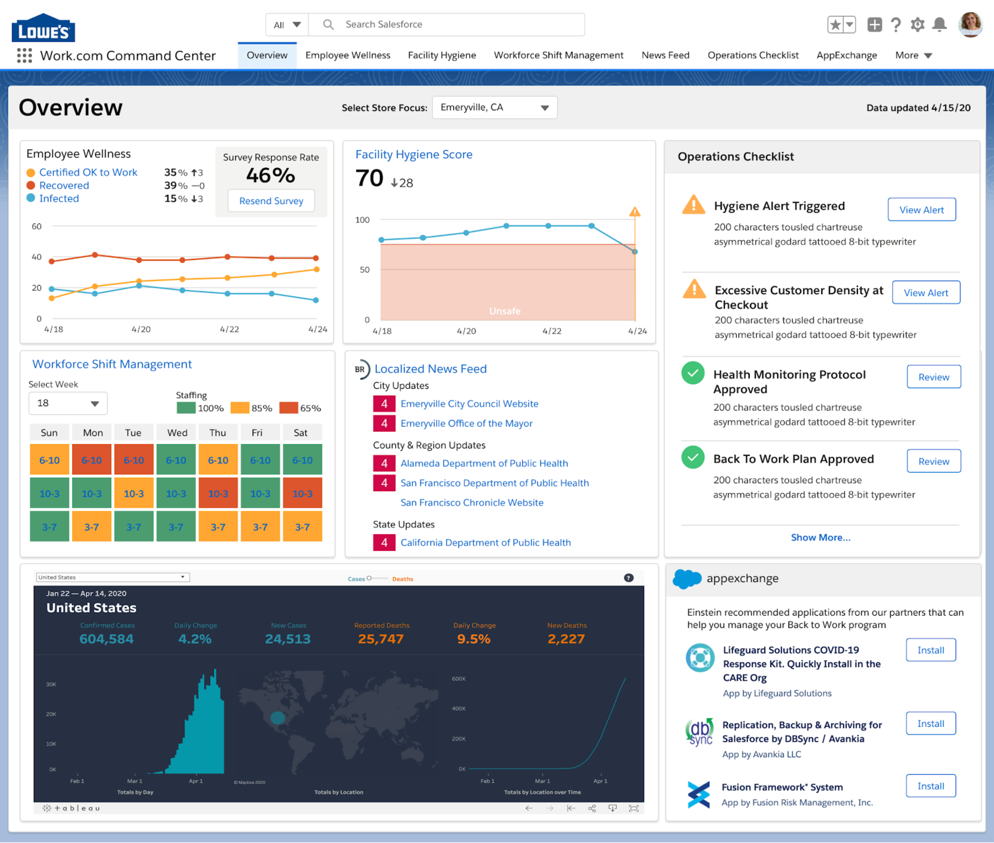
A second was a centralized command center to support Salesforce's effort to provide useful tools for addressing pandemic challenges.

Operations Dashboard

Streaming Analytics Platform

At this streaming data analytics start up I built a design studio of 5 that executed all design work for product and marketing.

I acted as player/coach managing and growing my team, directing the overall creative output of my studio, leading detailed design projects and providing the executive team with UX strategy.

"Tim is a great designer and brings a broad set of skills to the product development process. At Jut, he built and effectively led a talented team of designers. He can institute rigorous process when it matters and do more free form work when needed. Tim is fun to work with, and most important, he is a high-quality human being. I'd love to work with him again."

Steve McCanne, Coding CEO at Brim

Streaming Analytics Platform

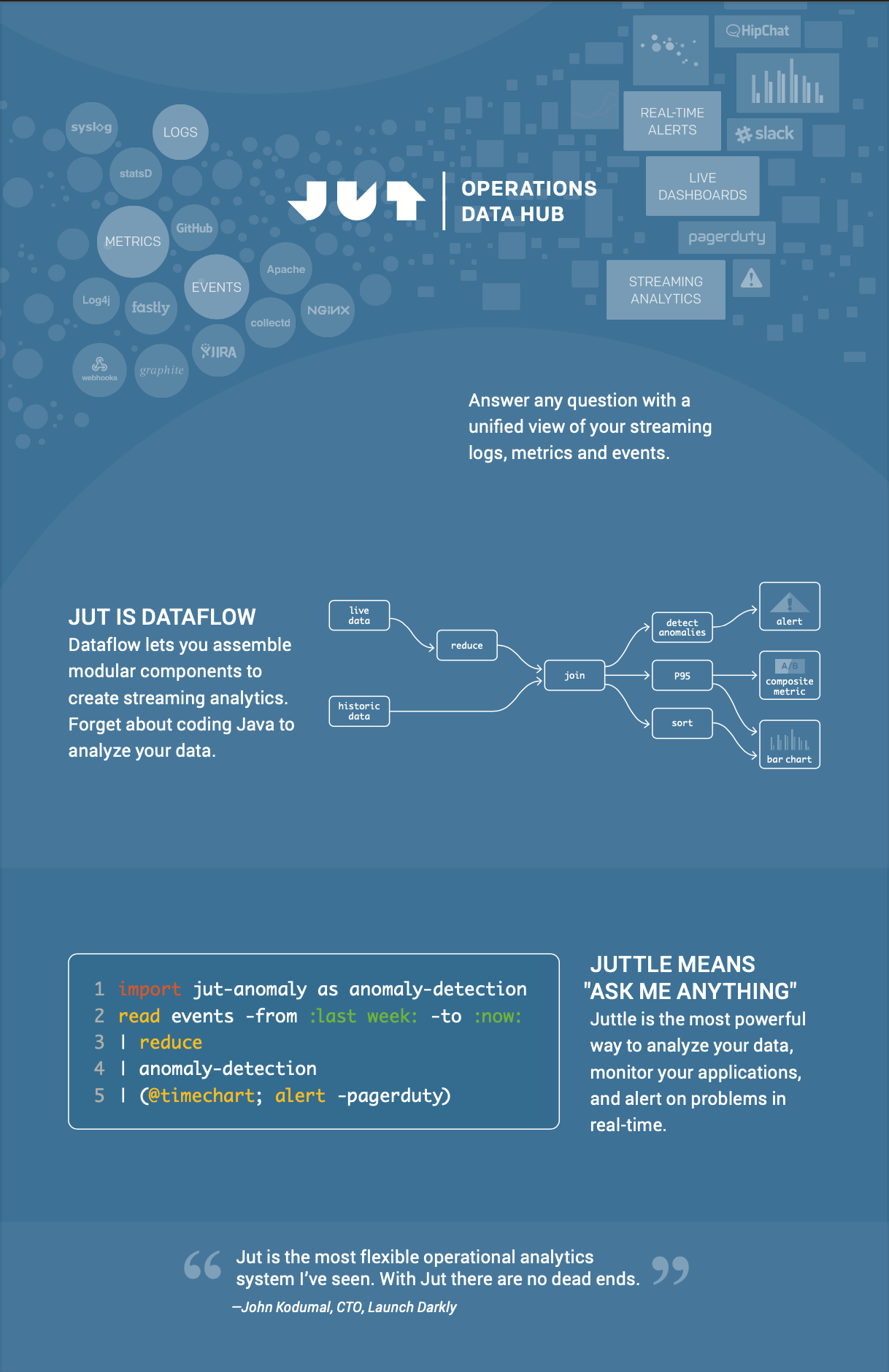
Jut was a streaming data start up. Our vision was "easy data visualization for DevOps." I was hire #7, or something really early like that, brought in to create and lead a design function from scratch for a team of ambitious founders who already represented the executive, product and engineering leadership. I owned the UX strategy for Jut, created our design system and built a small but mighty design team that produced a beautifully integrated brand, marketing and product user experience.

As a company we made a critical start up mistake and flamed out after only two years, however, those years were some of the most interesting of my career.

Here's the story.

A Solid Discovery Process

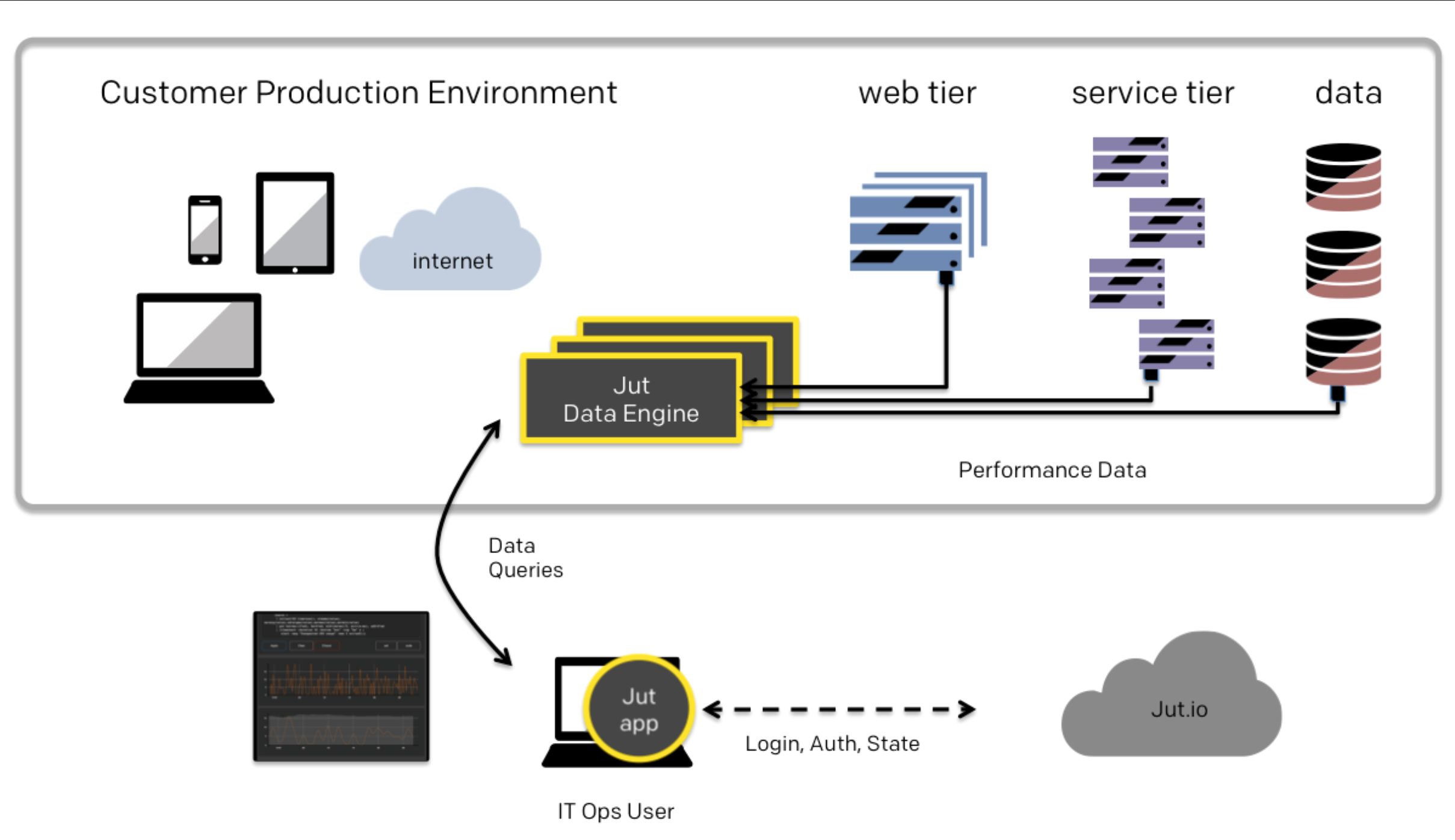
The Jut business startegy was to serve the DevOps market with tooling for monitoring and troubleshooting production software installations.

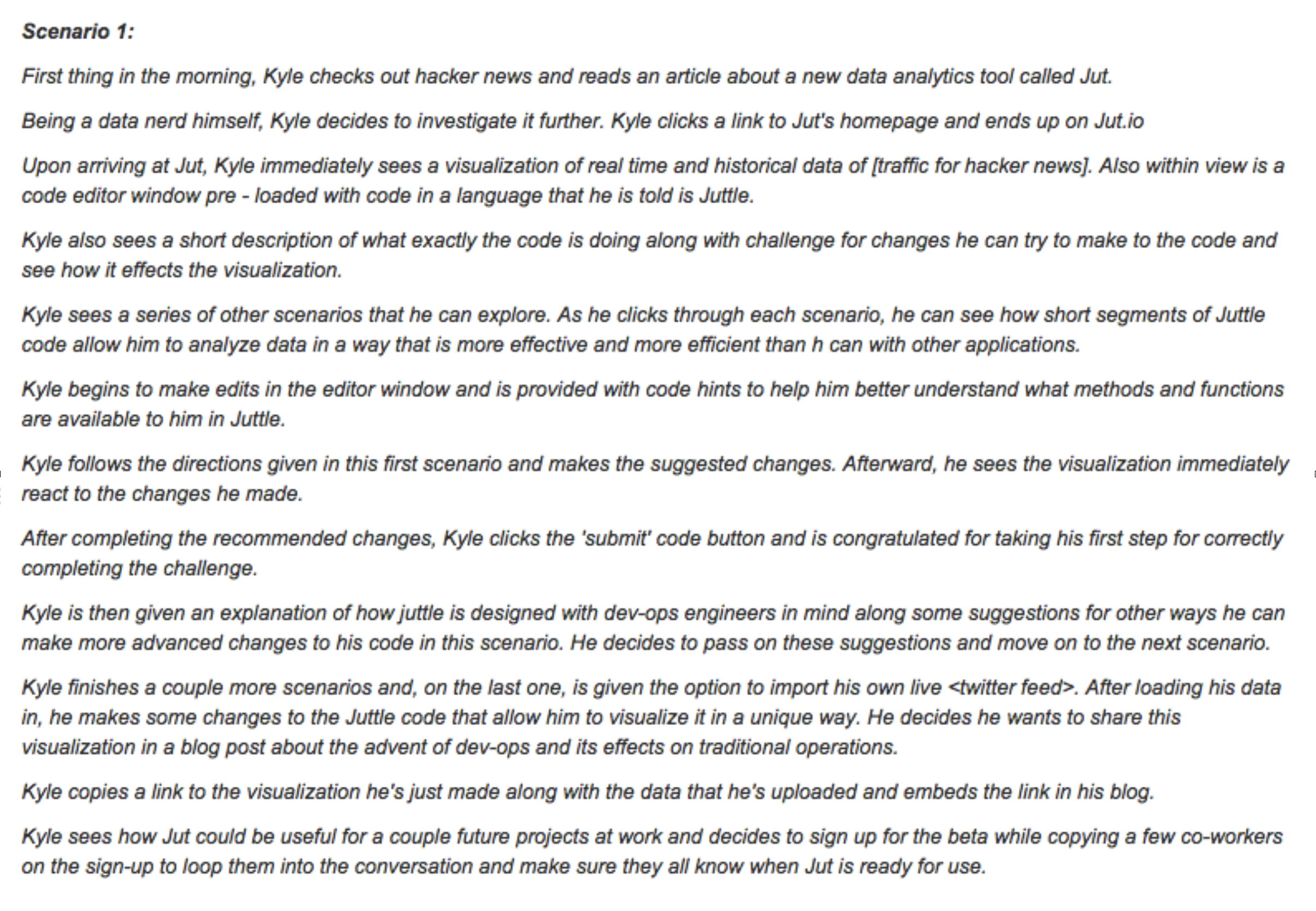
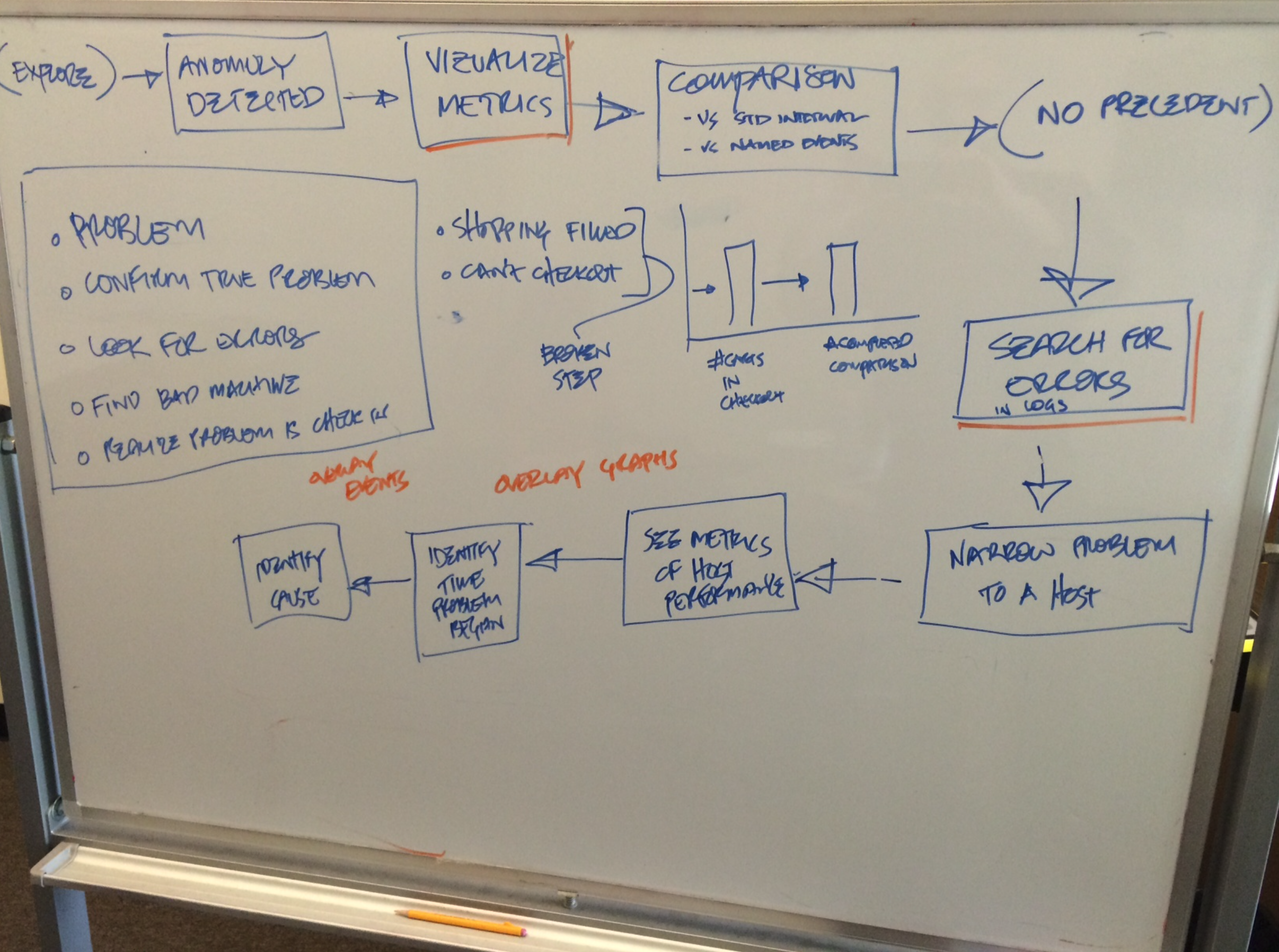
Things began, as they should in product development, by trying to understand our target users. Employing a variety of research techniques such as 1:1 interviews, attending DevOps trade shows and reading community blogs I led the founders through the process of creating personas.
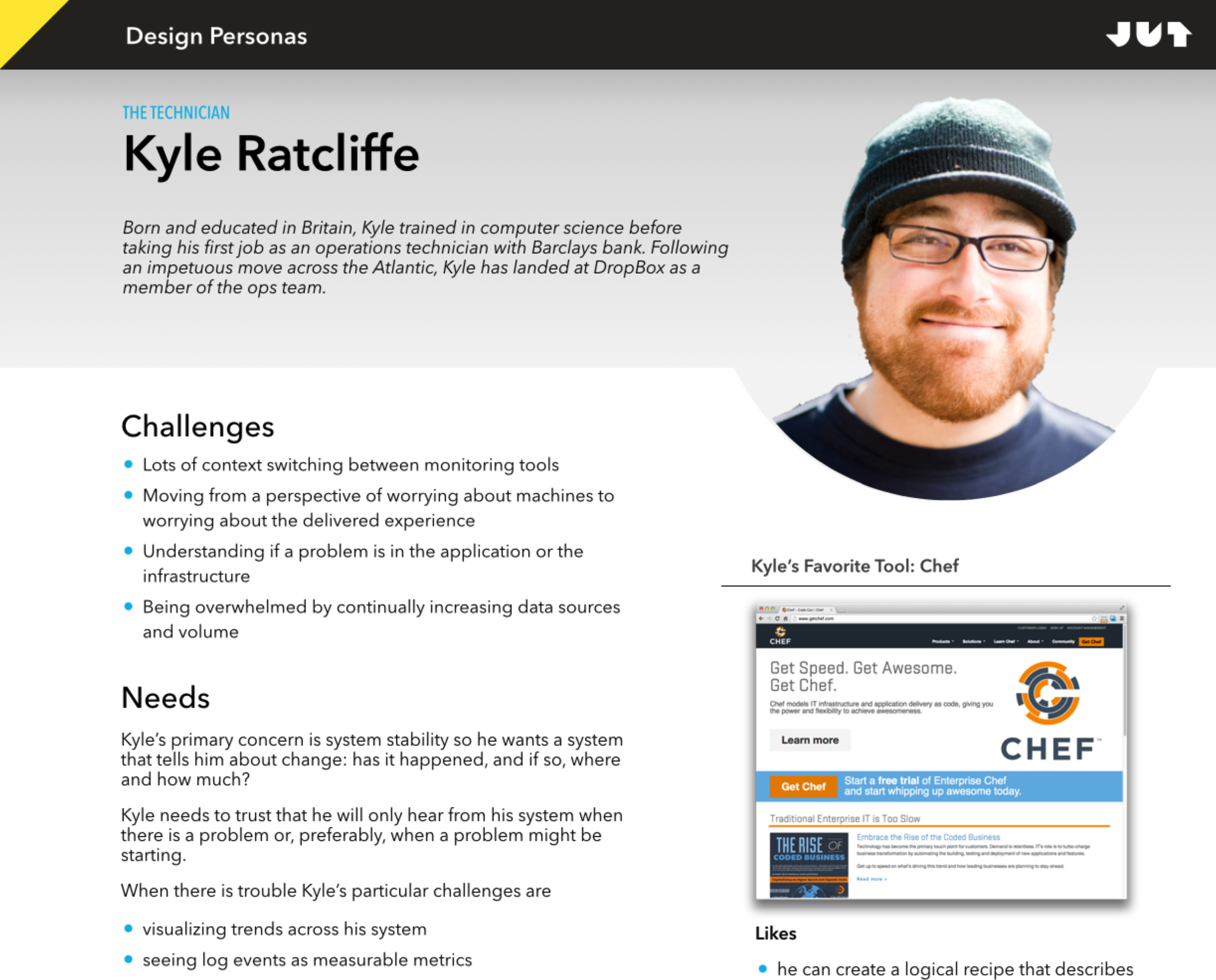
I drove the research and development of Kyle, our primary persona

I helped the founders structure their DevOps vision by introducing them to the notion of "design by story telling," using both text and visual formats.

Every design begins with a story

These promising beginnings led to a collaboration with a CDN provider as a design partner. This relationship resulted in a well received prototype that gave Kyle a visual overview of all the event traffic on his network, combined with a simple mechanism for filtering to the events coming from particular logical or physical nodes during a particular time window. Kyle (that is, real people like persona Kyle) thought it was a great tool for rapidly locating problem spots when troubleshooting network issues.

The Mistake

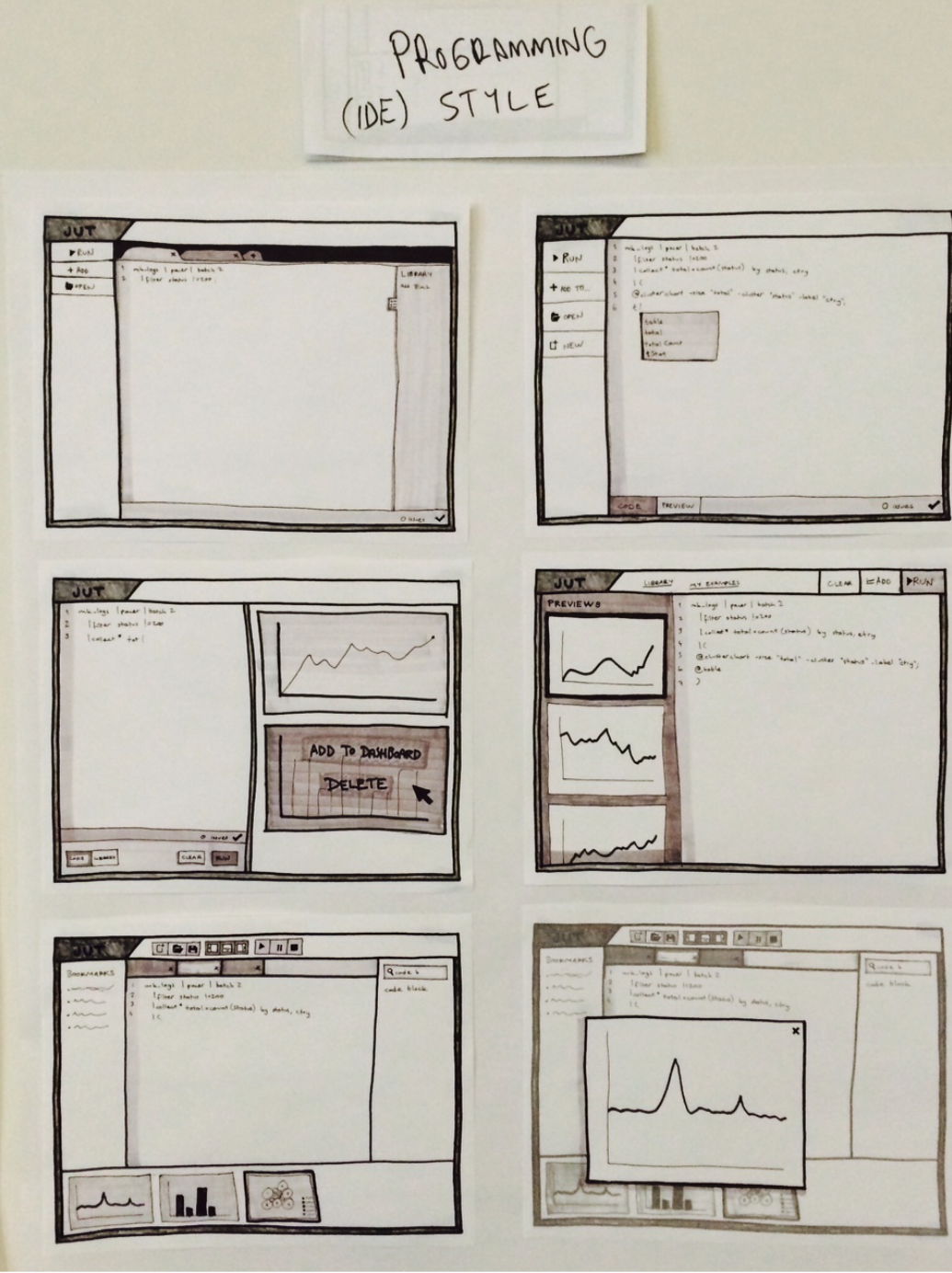
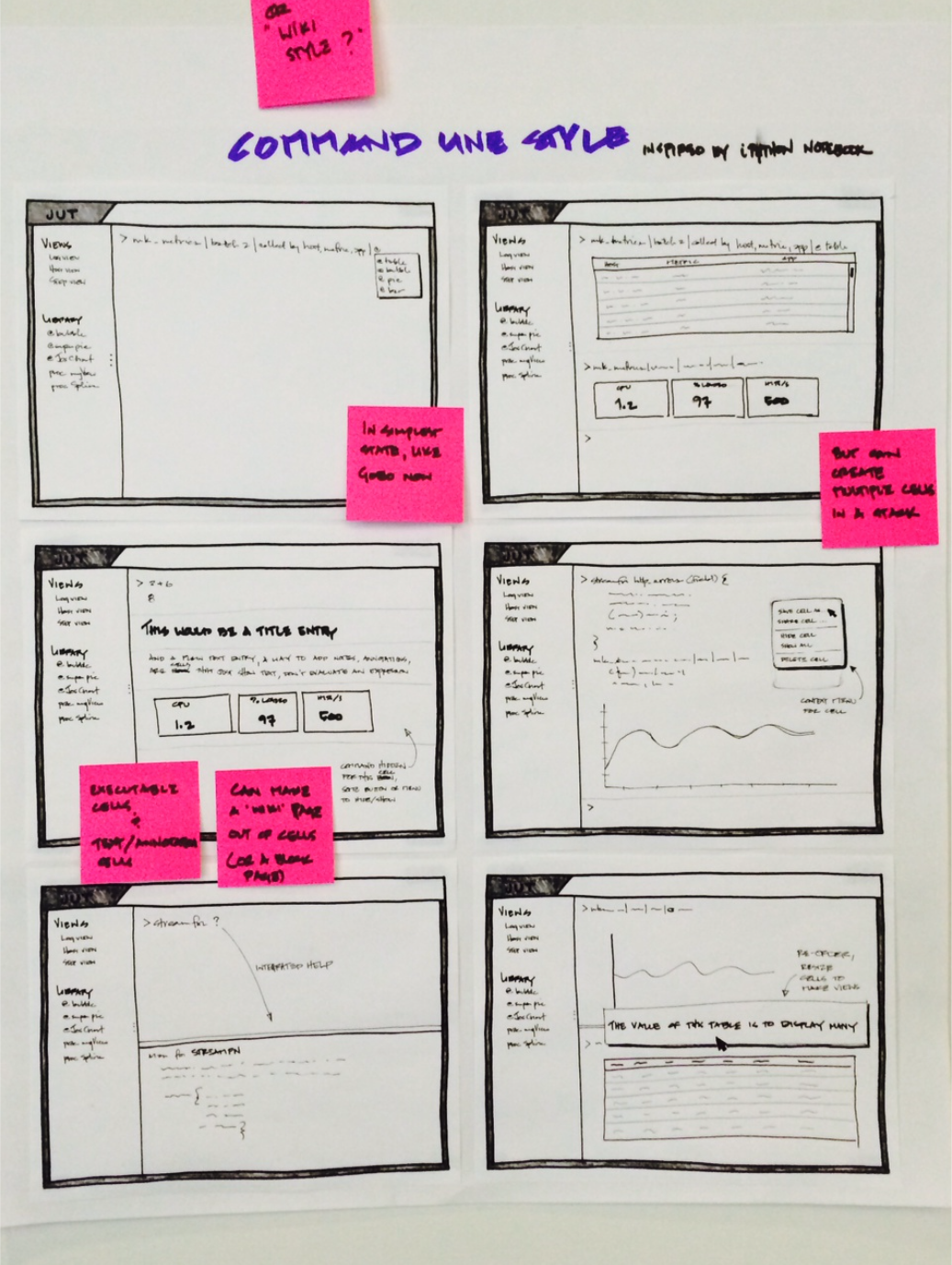
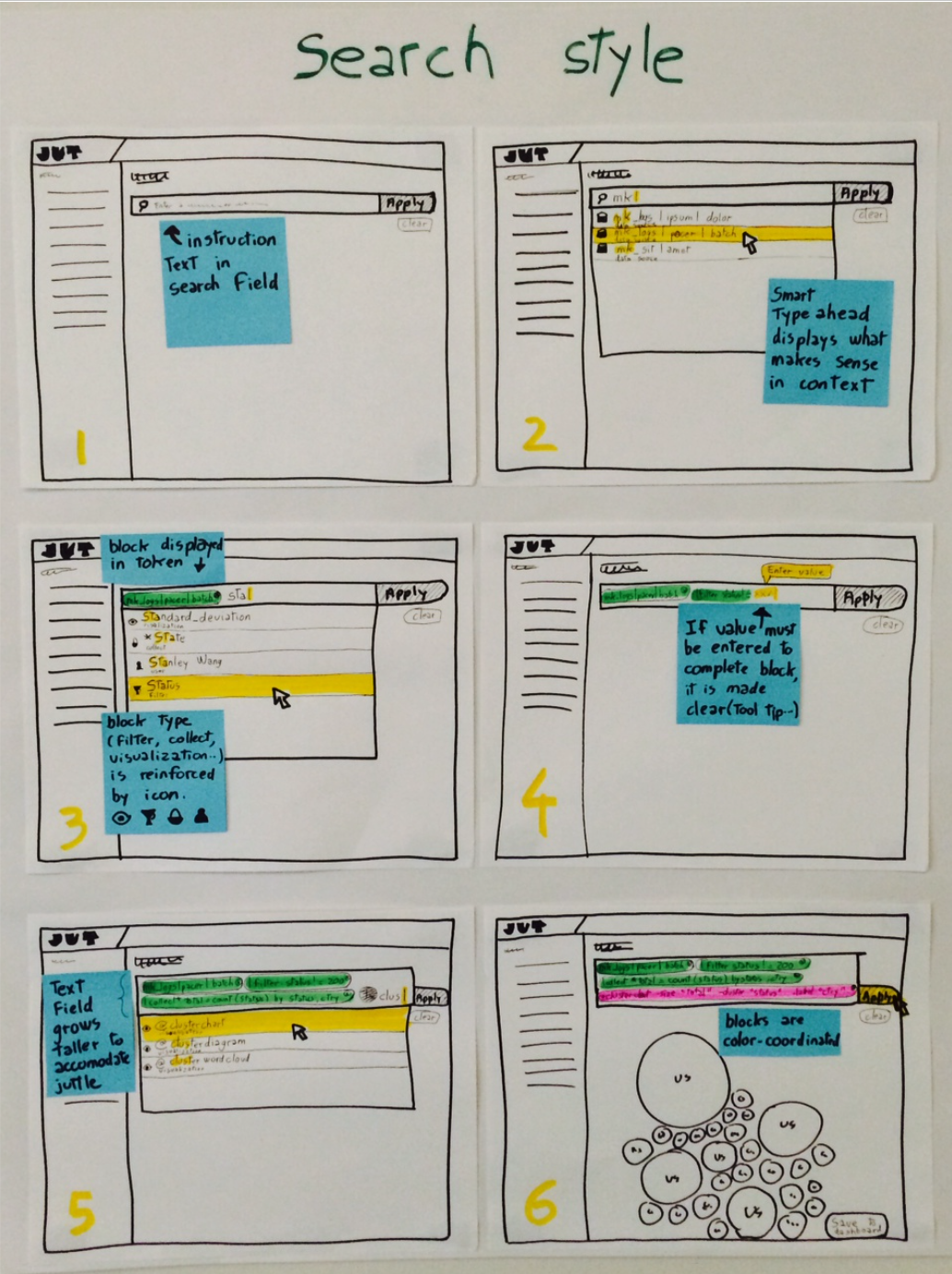
The next step after our successful initial prototyping experience was to begin creating our actual first product. This produced an intense debate about which of three different application styles to pursue:

  • an IDE, like a programmer would use
  • a Notebook, like a data scientist would use
  • a Data Explorer, most like the prototype, that was primarily a diagnostic tool, navigated by searching & filtering

The source of this conflict came from the tension between developing an application or a platform. We'd prototyped and tested an application for Kyle but the founders the real value would come from building a platform based on a new programming language they would create, to be called Juttle, with syntax optimized for analyzing, visualizing and alerting on streaming data at scale.

To visualize the options I organized a sketching session where I asked 3 teams to sketch the same 6 steps in a workflow, but using 3 different interaction models. The result was an "apples to apples to apples" visual comparison of the different strategies.

Three possible UX models

And here the team made a critical, and classic, mistake: the decision was to create an experience, midway between an IDE and a Notebook, that would be most useful to our internal team that needed a tool to write, test and debug the new syntax they were creating.

Mine is not to wonder why…

At this point I had personal doubts about our product strategy but I loved the team, the culture and knew that given the size of our war chest, worst case it'd be at least two years before I had to look for a new job so I accepted the executive call and began to wireframe key workflows.
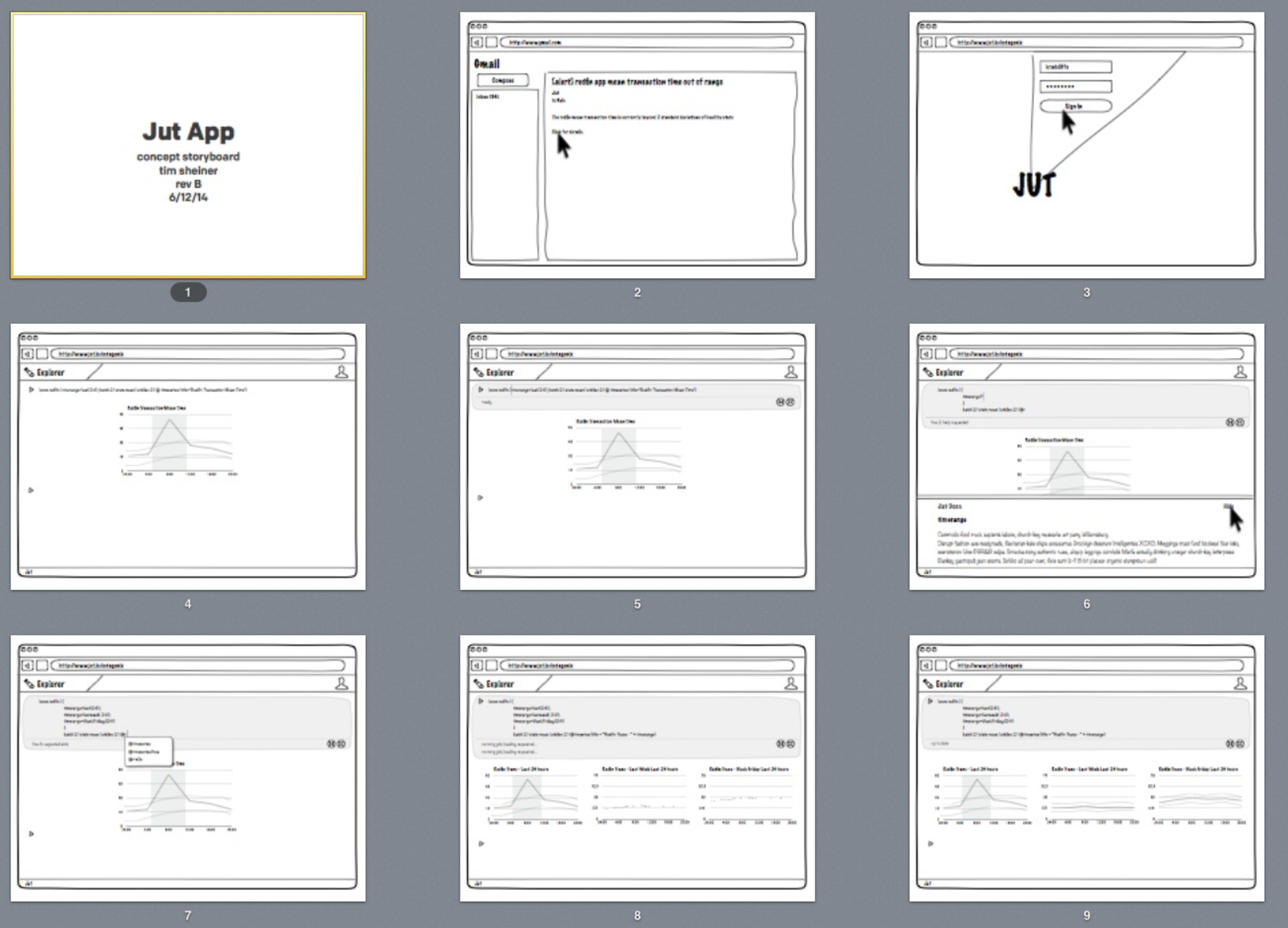
The notebook UX pattern is great for "exploring" data programmatically

Simultaneously, I architected our design system and art directed its visual expression.
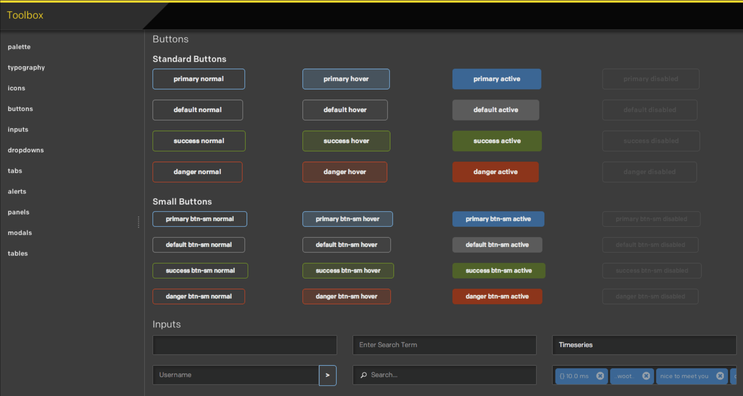
The Jut UI Toolbox was the 4th design system project of my career

I combined our UI "toolbox" and wireframed flows to produce and refine high resolution mock ups.
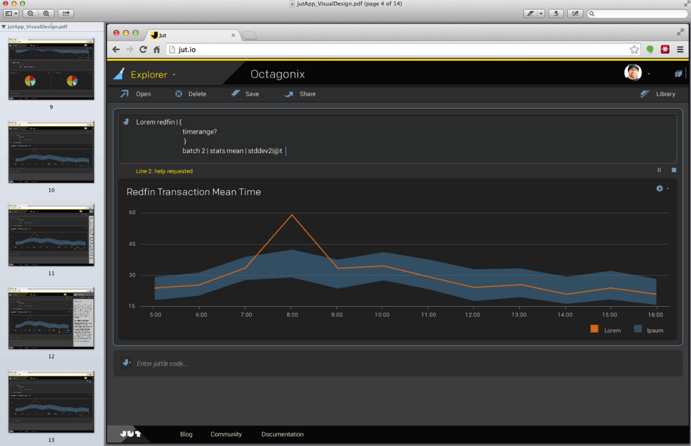
Before Figma and Sketch, I thought Keynote was a pretty good prototyping tool.

Meanwhile I used visual modeling techniques at various levels of abstraction to catalyze internal consensus about the system we were building.

Part of UX strategy is aligning the team on visual concepts

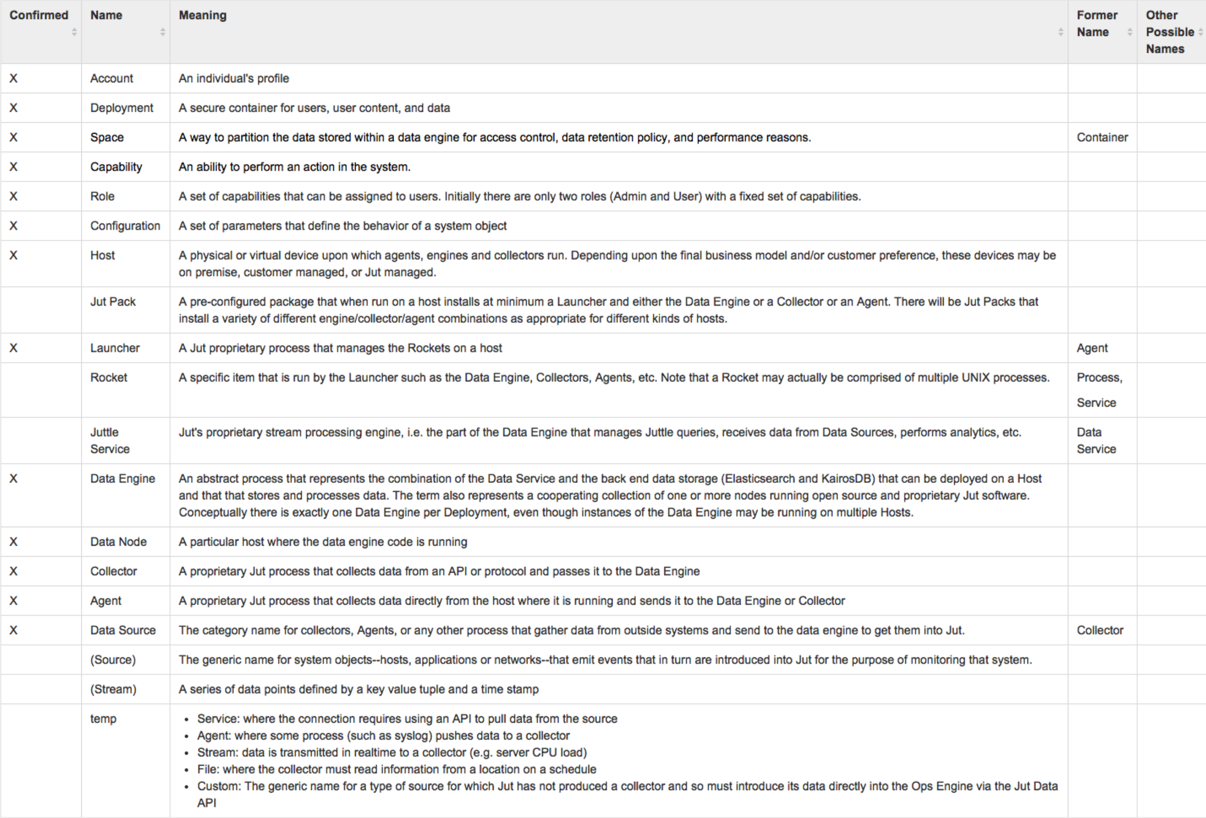
I focused intensely on ensuring we had alignement on our object model and the words we used to describe the concepts in our system.

No project succeeds without shared terminology.

I extended the scope of UX beyond the GUI by designing our charting syntax.
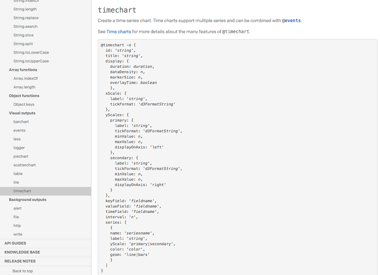
Declarative Charting Syntax

Meanwhile my energy, can-do attitude and work ethic created trust with the founders who responded with a promotion and budget to grow my design team.

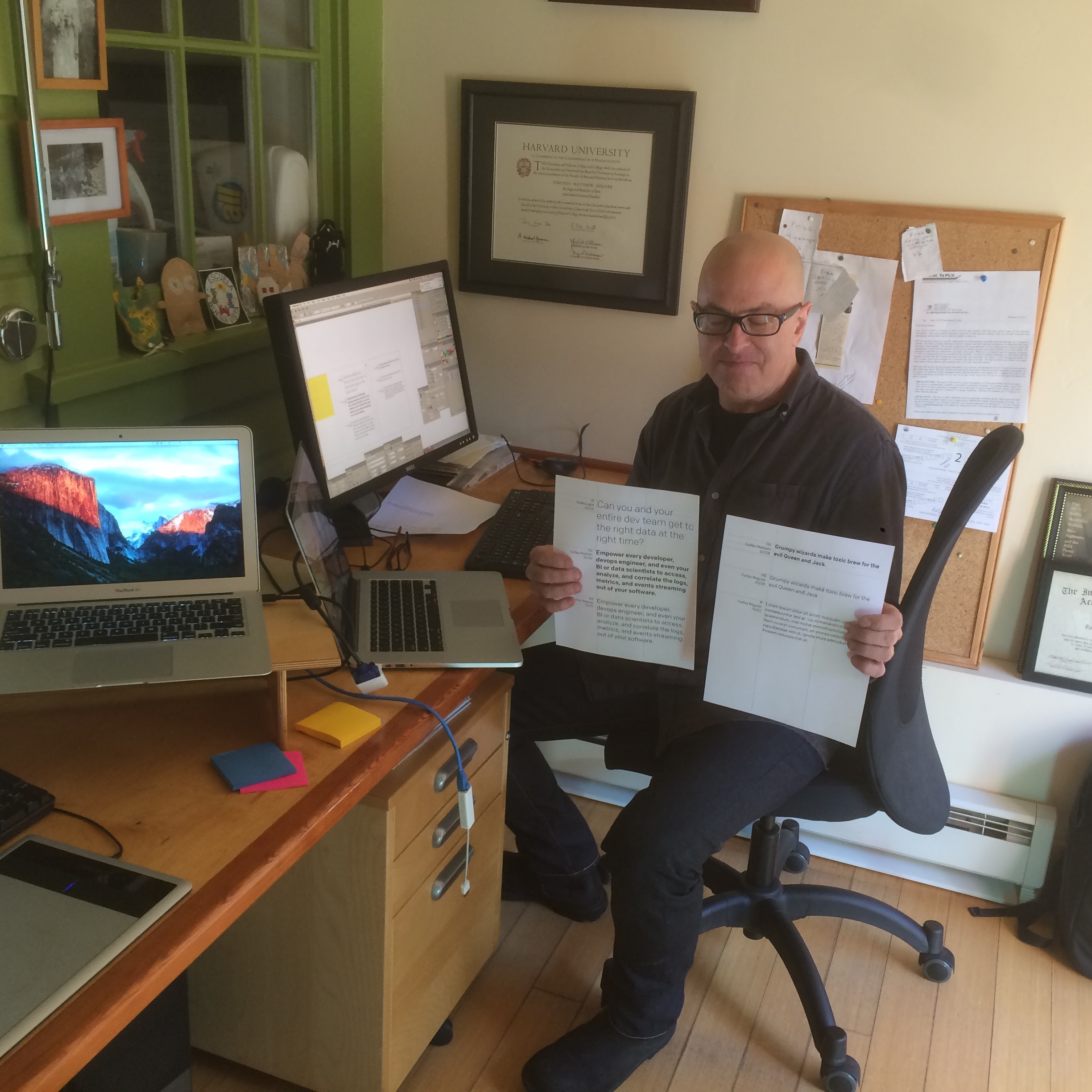
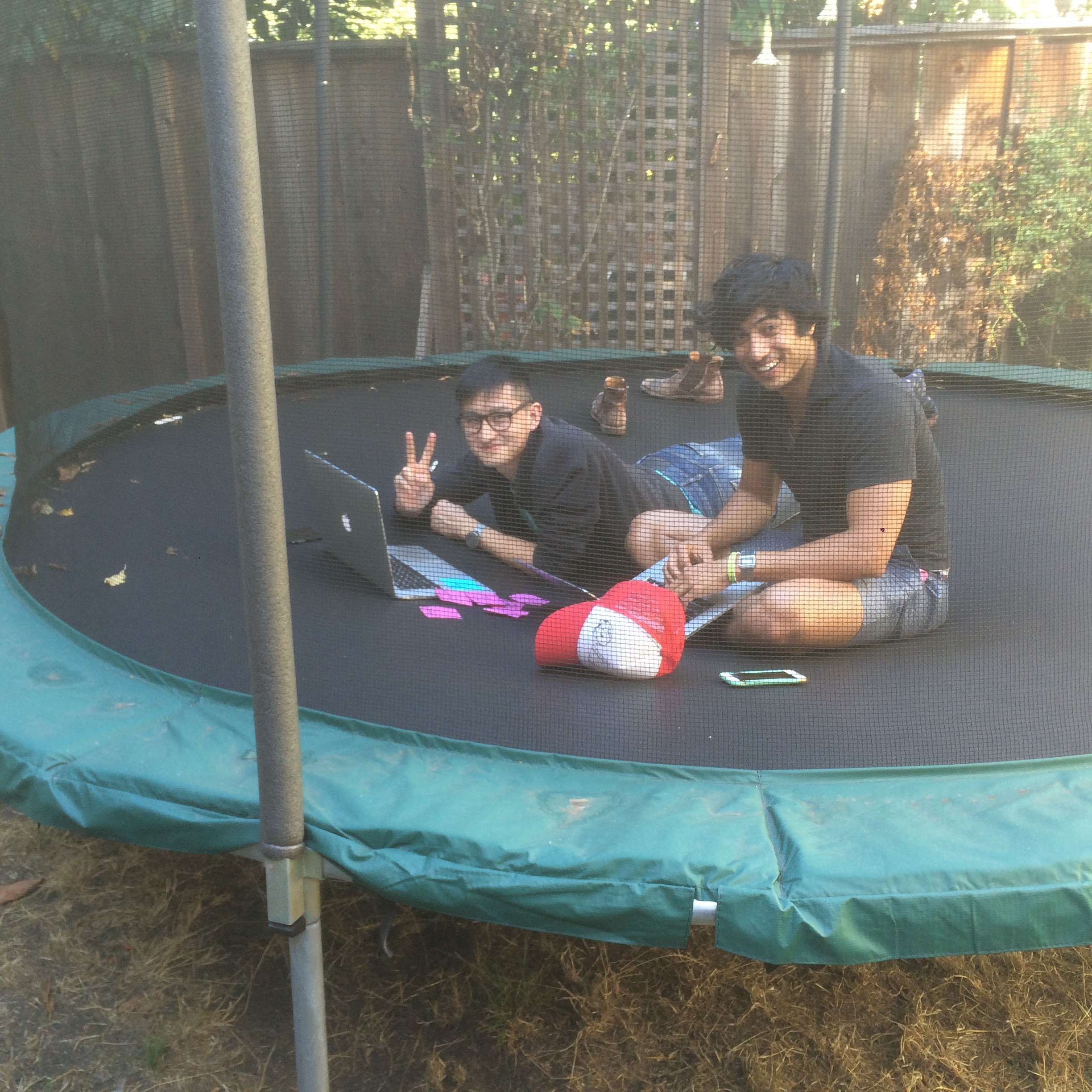
Scenes from a charette at my house

Hello World!

All of this design work, plus some truly amazing engineering, enabled the team to release an extremely powerful tool for analyzing and visualizing streaming data. At least, powerful if you were one of the ~30 people in the world who knew how to write Juttle.
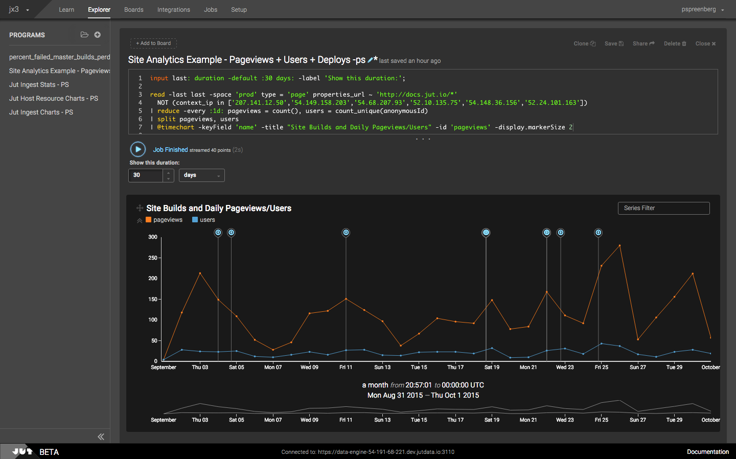
Real-time & historical events and logs could be displayed in a single dynamically updating chart.

We also had a nice set up experience for connecting data streams to our system.
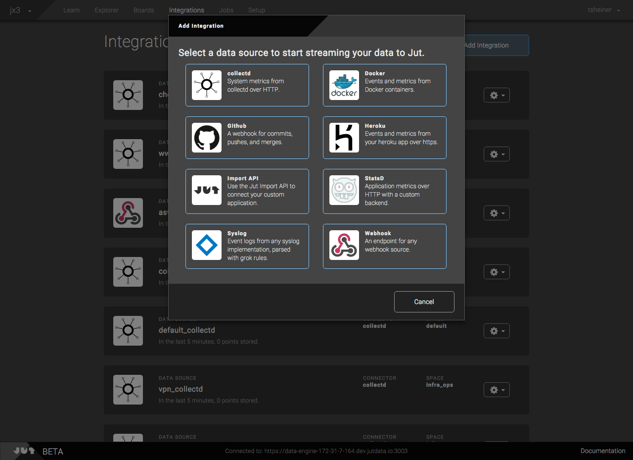
Data Integration GUI

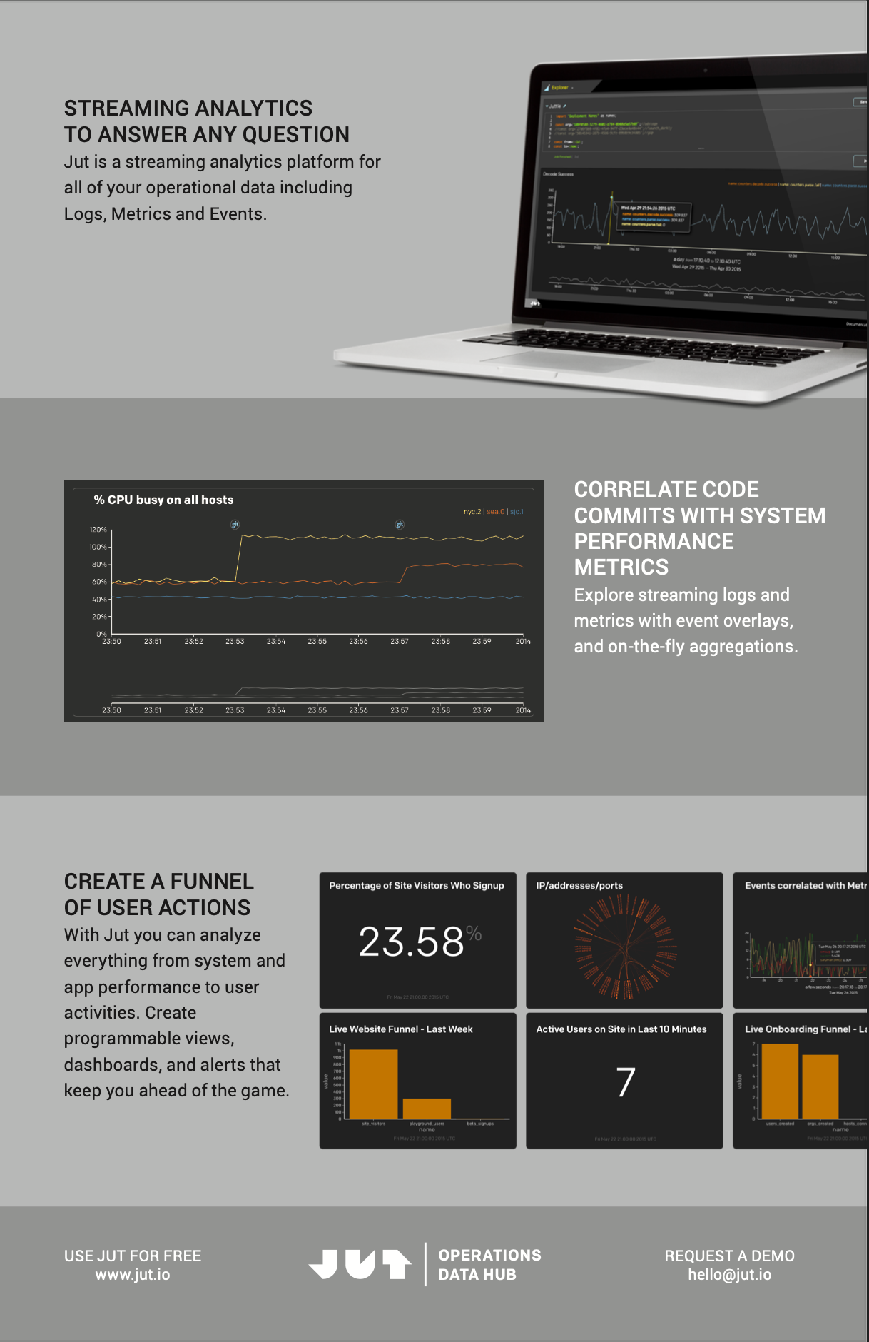
My team was also responsible for all the marketing design deliverables. We really enjoyed the chance to create a tight integration between the marketing and product experiences.
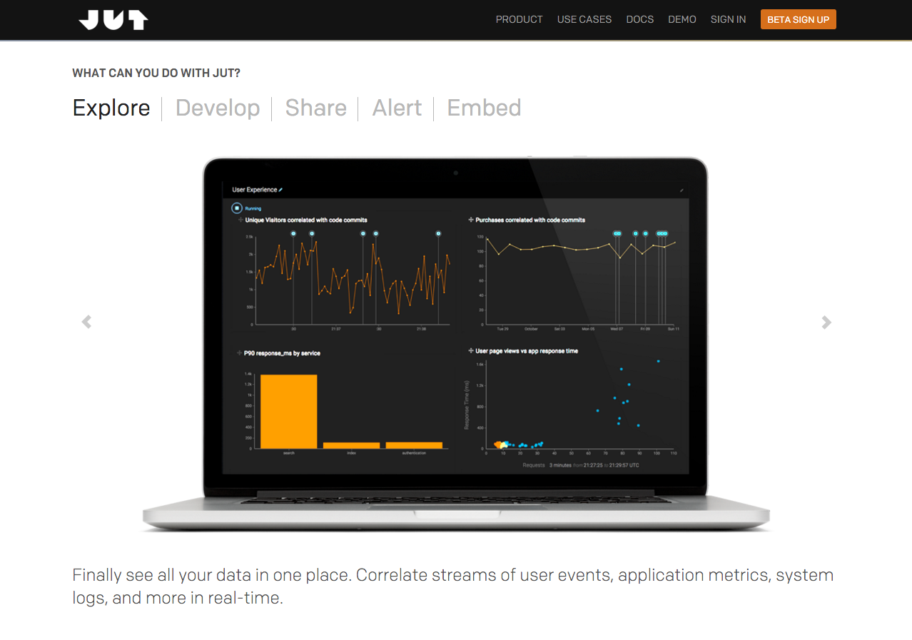
Website for Product Led Growth
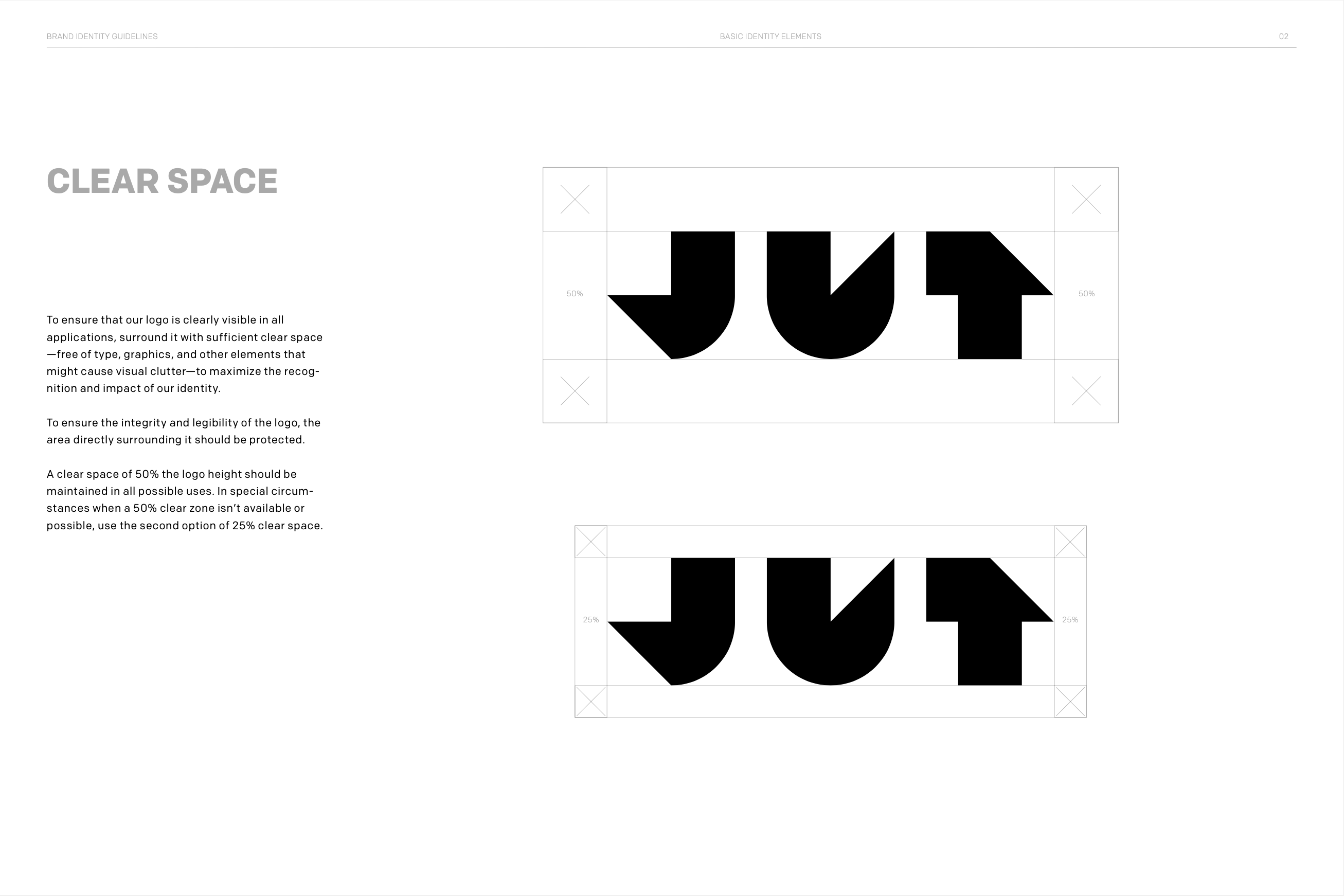
Brand Guidelines

Marketing Cutsheets

Unfortunately, none of this great work could make up for the fact that a product strategy of "you need to learn a new programming language" was a non-starter. Juttle was amazing, but because of the time that had to be invested to understand this, very few people actually tried our product.

Once again, with feeling!

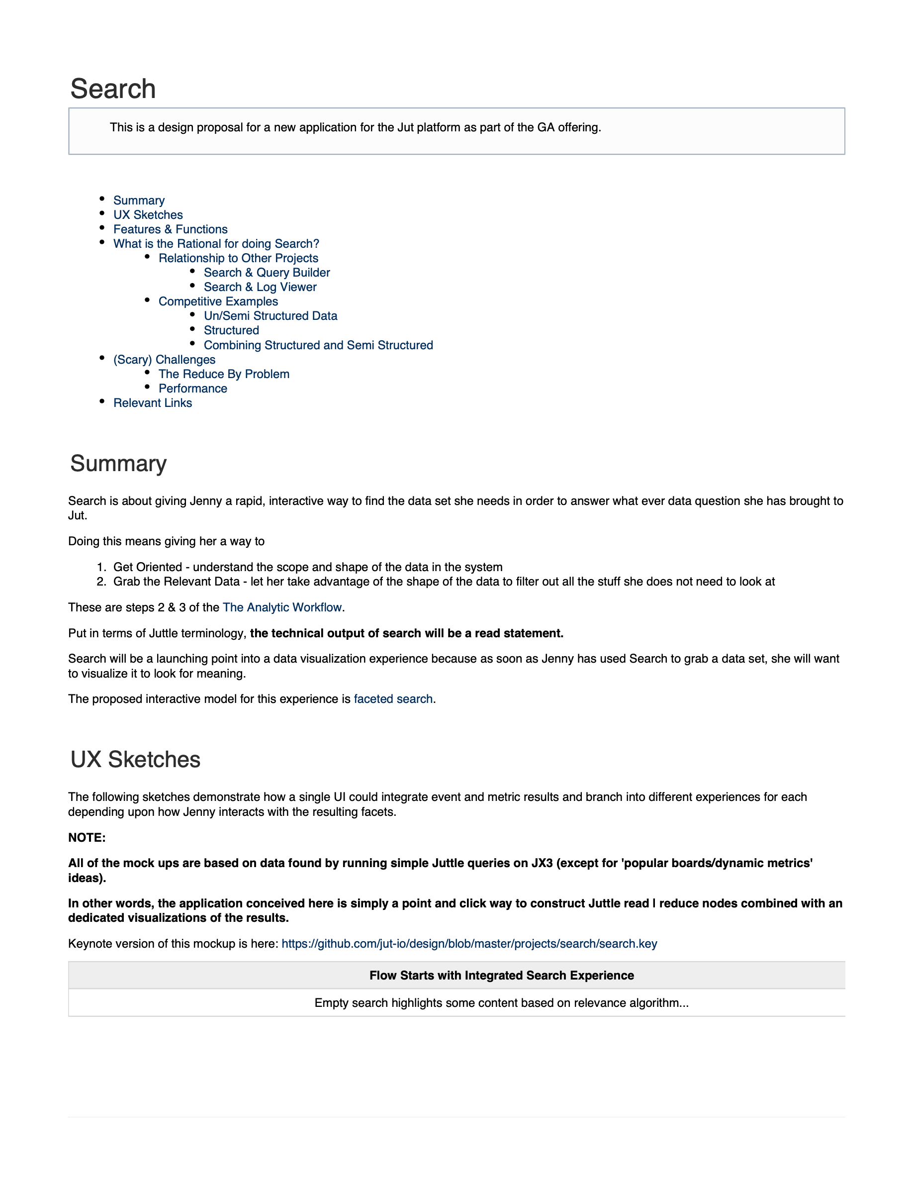
My response was to go back to the beginning and make the case for creating a productized version of the search-based diagnostic experience we'd prototyped originally. I took on the role of product manager, and wrote a product brief complete with hi-res wireframes.

Product Brief

On the strength of this proposal I got one engineering resources to help me build an MVP. Interestingly the "platform" strategy showed its strength because using only Juttle and the Jut design system we were able to create a functional application extremely quickly.
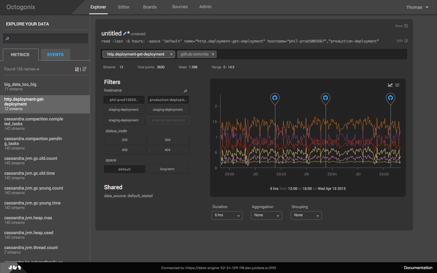
The power of Juttle via Point and Click

When I took this out for user testing the response was great. Sadly, we had begun this pivot too late. Out of money and time, Jut was shut down after 2 years, pretty much exactly matching my worst case prediction.

Overall Jut was a wonderful experience, one that created great friendships, exposed me to fascinating technology, gave me a chance to grow as a design leader and will go down as the proudest failure of my career.

Business Intelligence Platform

I improved the user experience at this BI start up by introducing a faceted search functionality and a modern look and feel. The new UI framework I designed and coded was standards-compliant and easily-themed to support our white label business model.

"Tim transformed Jaspersoft. He took a product weakness and turned it into a competitive advantage."

Mary M. Flynn, Senior Director Product Marketing at Okera

Business Intelligence Platform

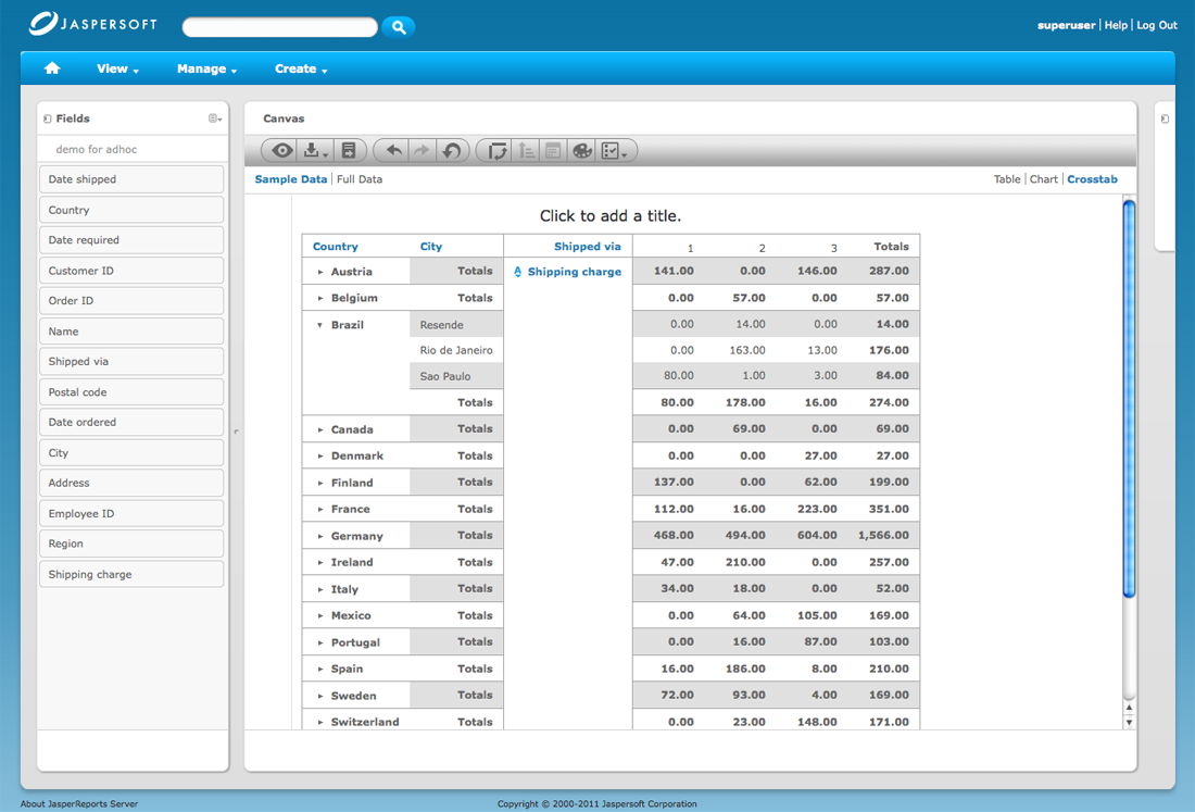
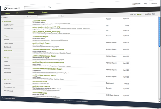
At Jaspersoft I was simultaneously lead designer, product manager and front end dev. I led projects that improved the product UX, visual design and technical architecture.

I modernized the interface look and feel.

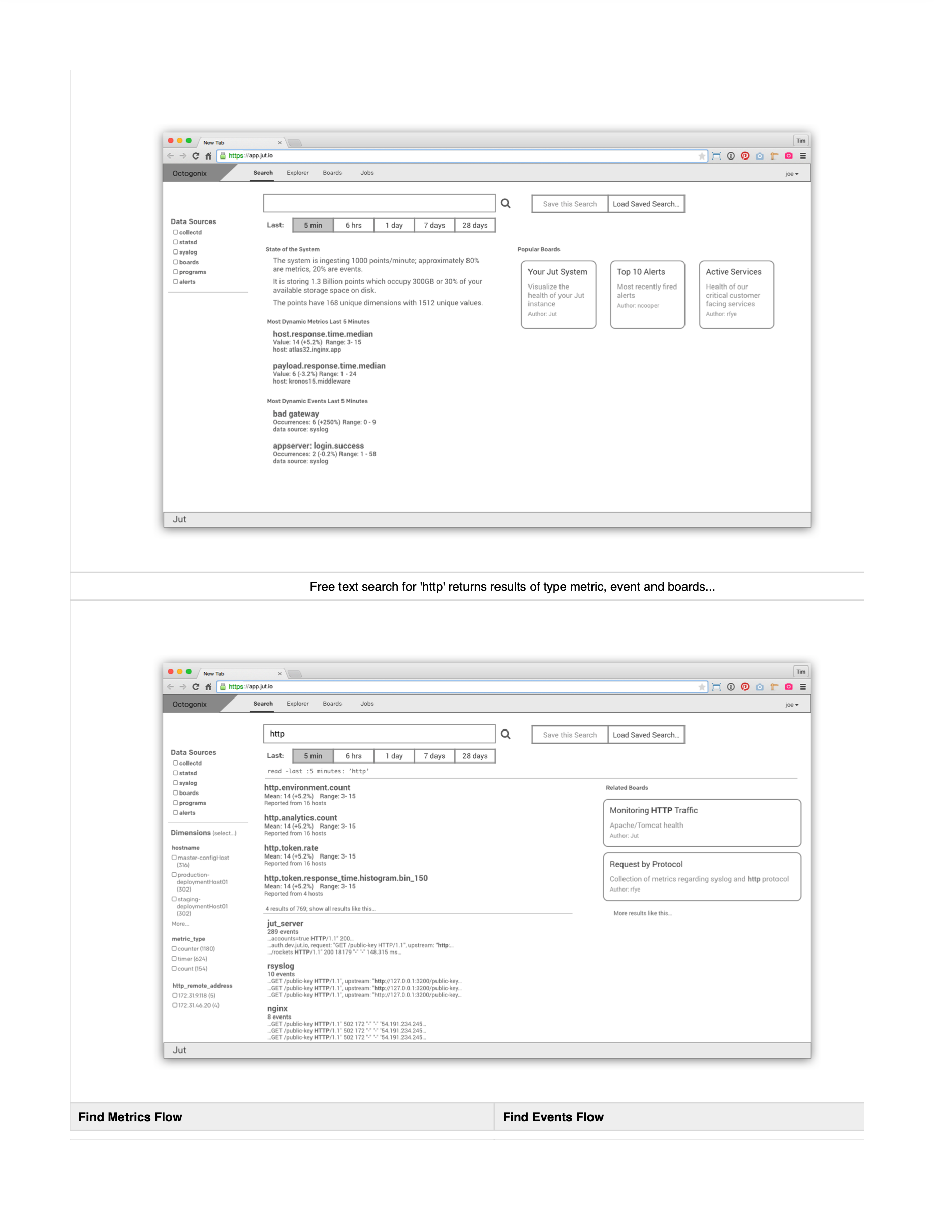
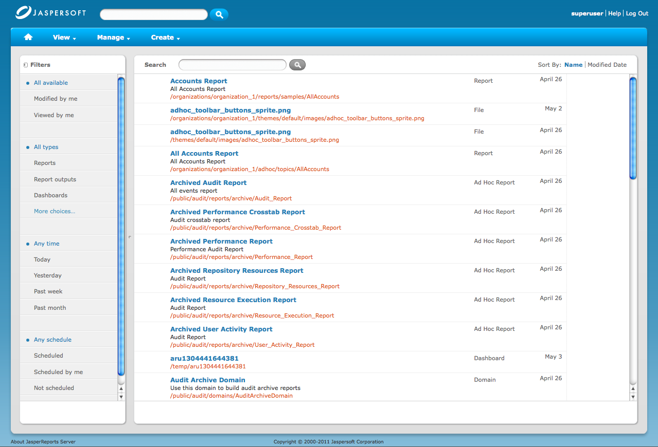
I introduced a faceted search experience.

The themeable front end framework I built supported our white label business model.

Content Delivery Network Self Service Application

I collaborated with a great team at Hot Studio to work on the redesign of Akamai's self-service portal. I contributed to the user research, UX strategy and design that led to a much easier to understand navigational model for the experience.

"I hired Tim to help us with a project to redesign a complex enterprise web application. He connected immediately with our internal team and also developed a strong positive rapport with our client."

Danielle Malik, Head of UX at Futuredraft

Content Delivery Network Self Service Application

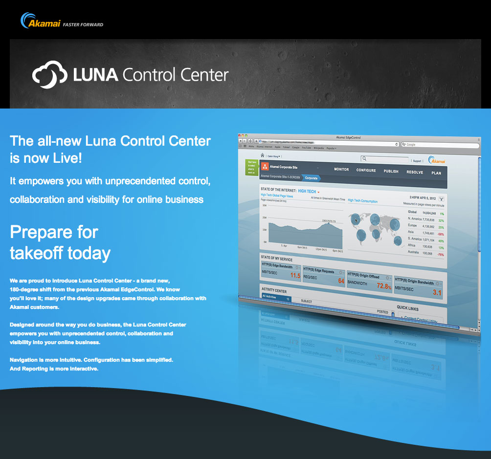
Our work for Akamai focused on improving the visual design and navigation for their management console.

CDN Monitoring and Configuration.

IoT Platform

I contracted with GE during the development of their Predix IoT platform to bring structured, repeatable user-centered methods into all stages of their Agile cycle. I piloted the process successfully, consolidated the win by mentoring a young designer succeed me and was gratified to see other scrum teams begin requesting dedicated UX support.

"Tim is an excellent designer, strategist, communicator and change agent. He consistently suggested ideas to me a month or more before I began to hear those same things from other people."

Dan Harrelson, VP, design leader, and advisory board member

e-commerce platfrom

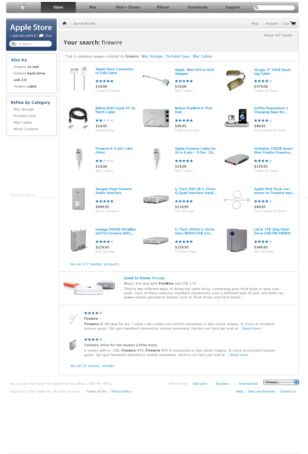
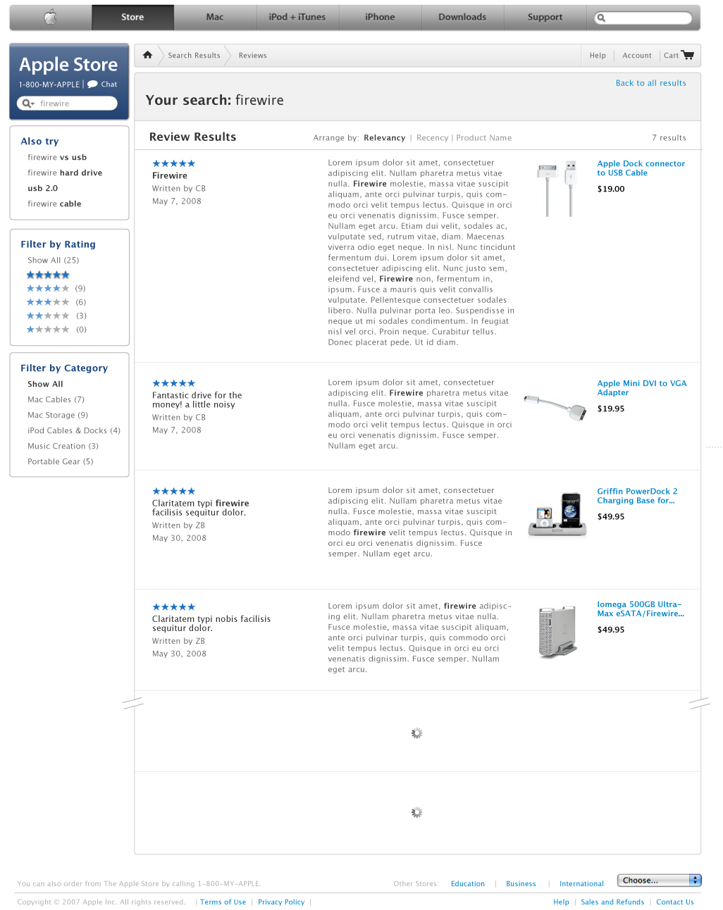
At Apple I worked on search and community features for our online store.

e-commerce platfrom

Working on the Apple online store, I gained e-commerce and search engine optimization experience.

Thanks for scrolling!

Now check out the values I bring to work or learn more about my backstory.